
 In-house · Social · Packaging · Print · Motion · Web
 Unicity
Seven years, three regions, one design desk — making a US health brand look like itself everywhere it lands.
The Brief
Make it look like HQ.
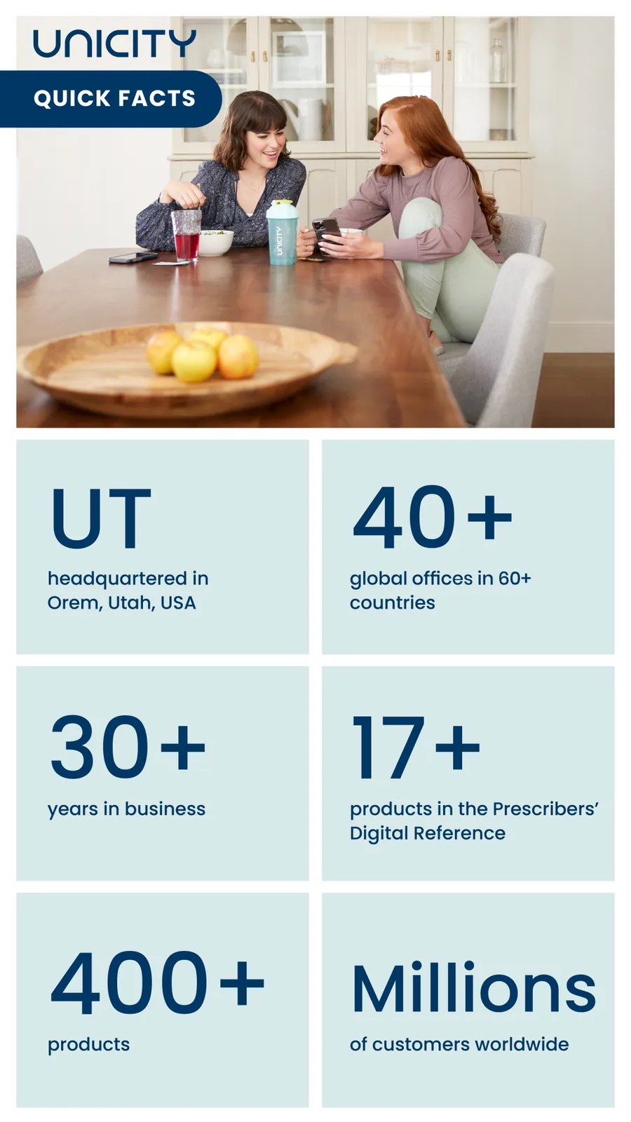
Unicity is a US health brand out of Utah, and every market runs to one set of global brand guidelines. My job, market after market, was the same sentence with a different country in it: take what HQ built and make this audience feel it — first India, then Europe, then the Middle East. One desk, one look, three regions that never met each other.
- 7+years in-house
- 3regions served
- 2designers led
- 1stin-market plan animation
2019–2022 · India
Made India look like HQ.
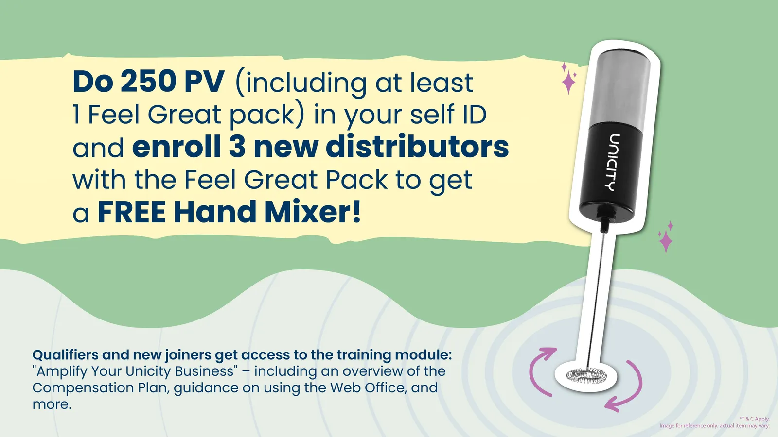
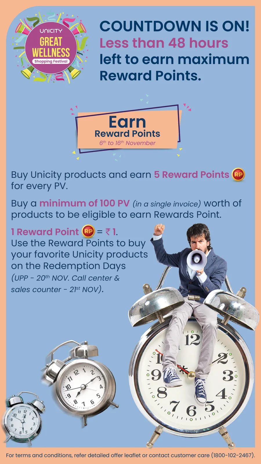
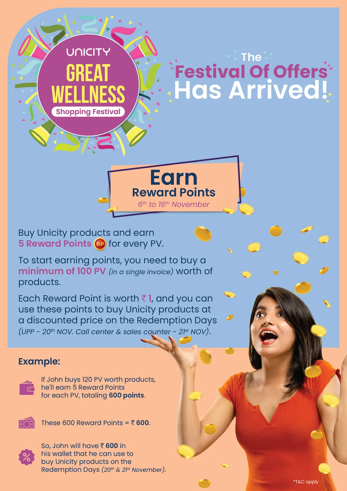
The India accounts needed to sit next to the US ones and not flinch. I rebuilt the look and feel of the social, posters and video from the ground up — premium finish, tuned for an Indian audience, but unmistakably the same brand you'd see coming out of Utah. Same DNA, local pulse.
Proof
Firsts, not just posts.
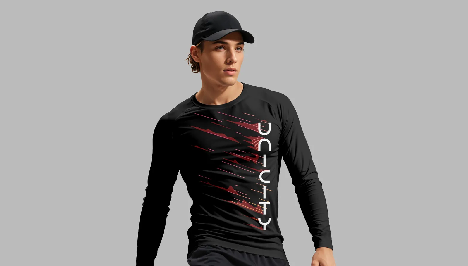
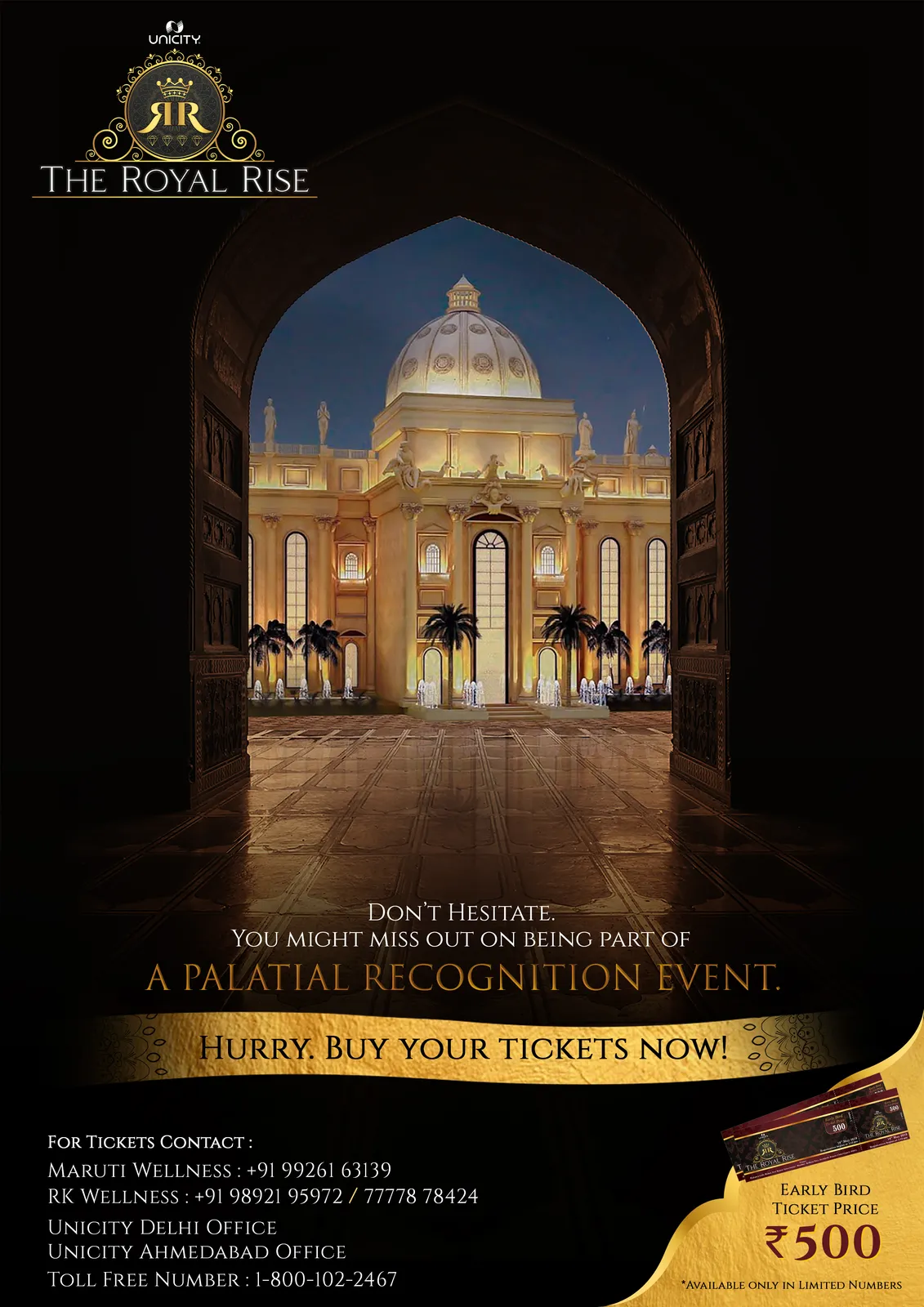
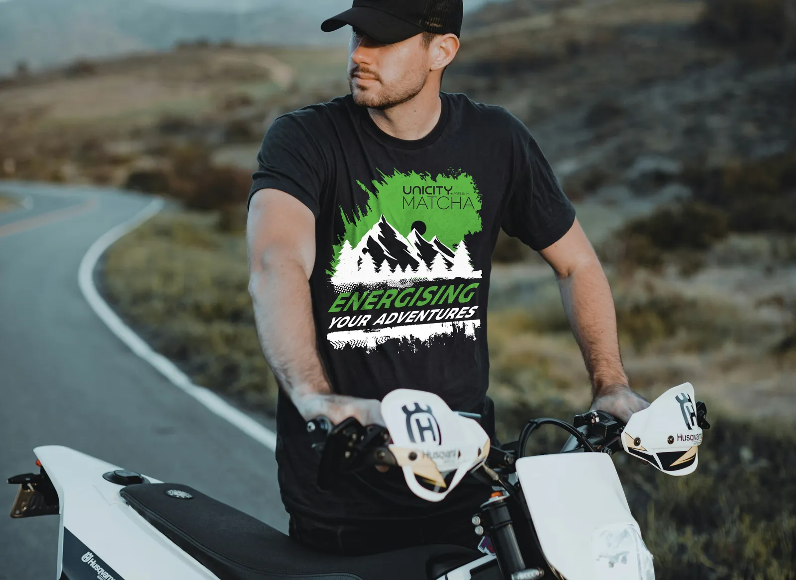
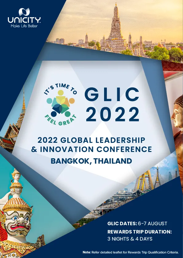
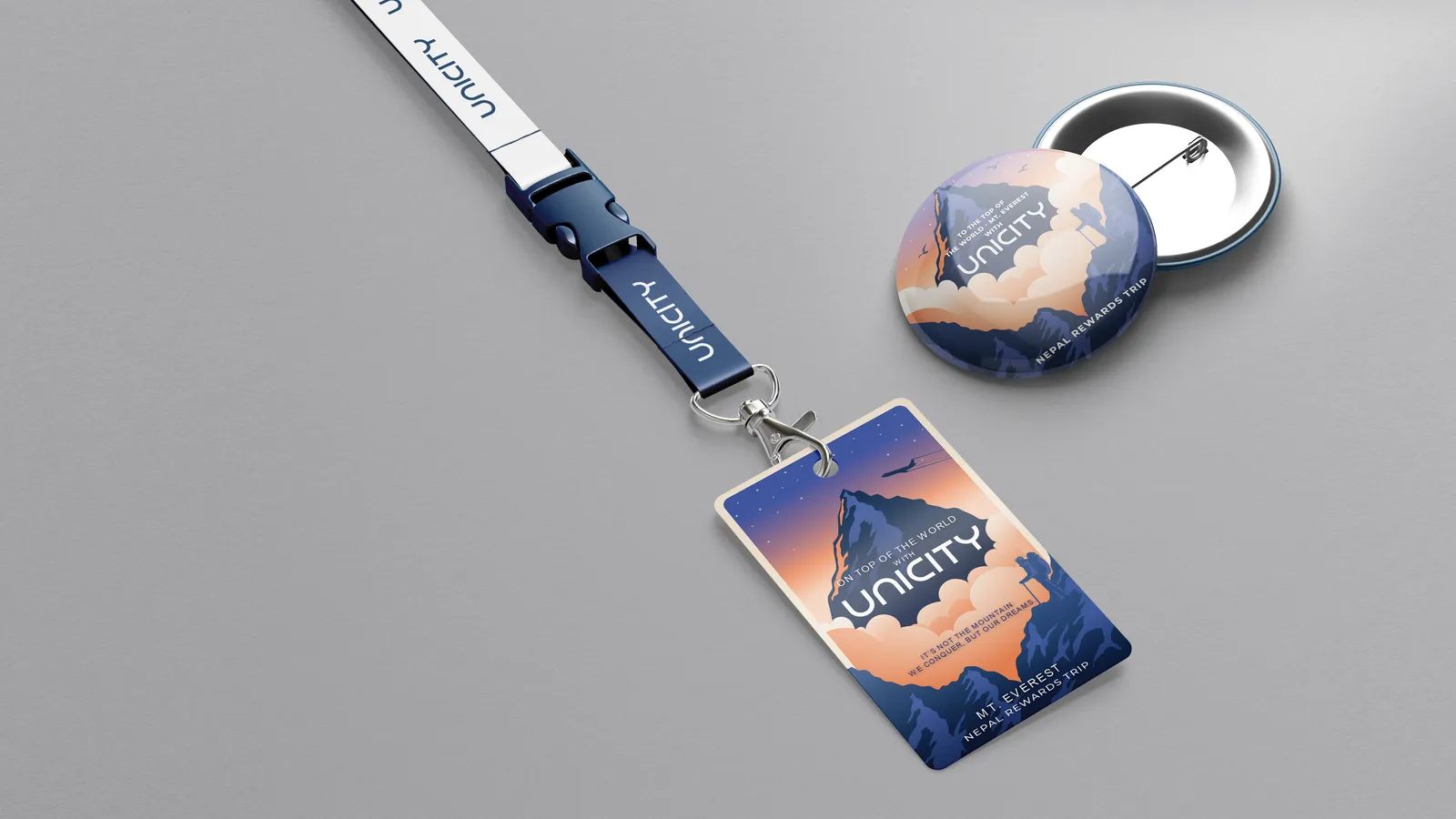
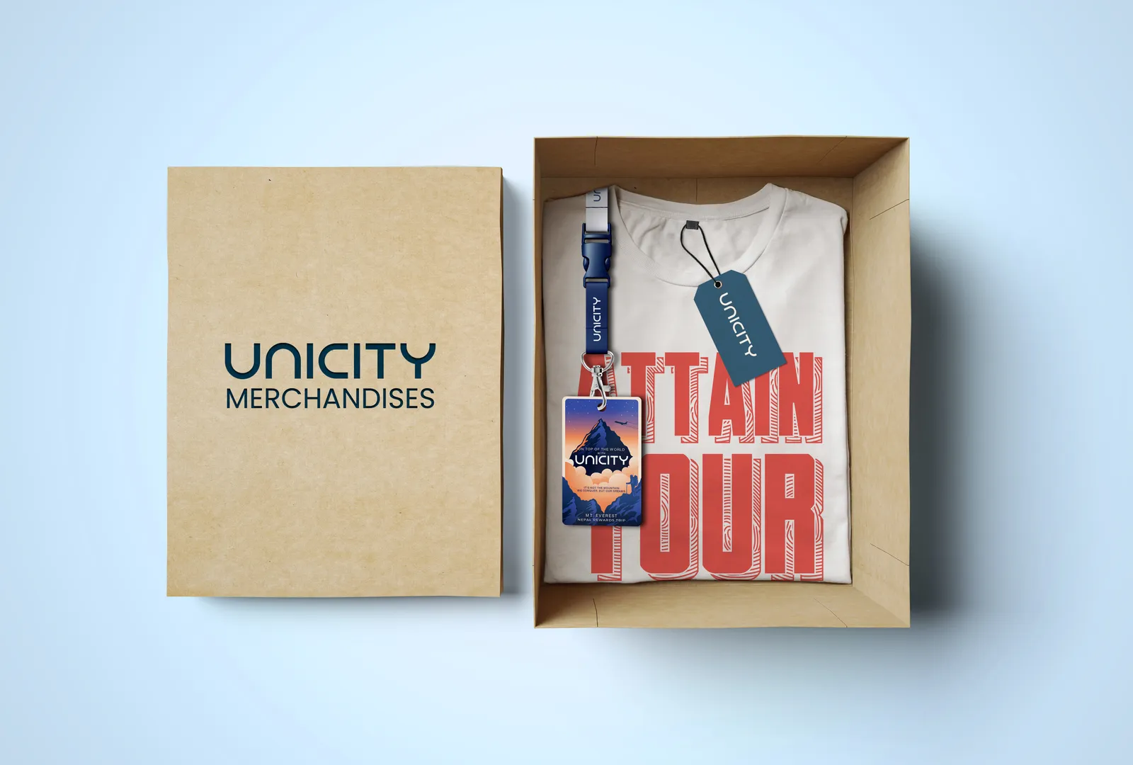
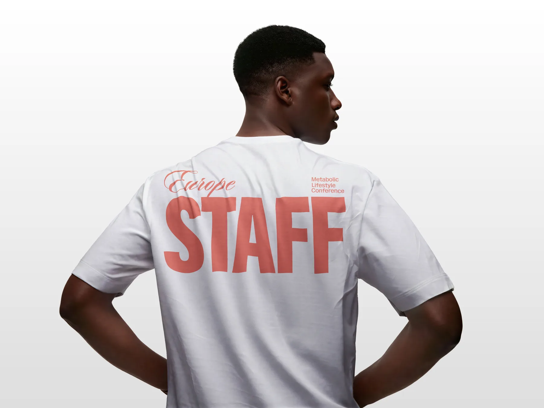
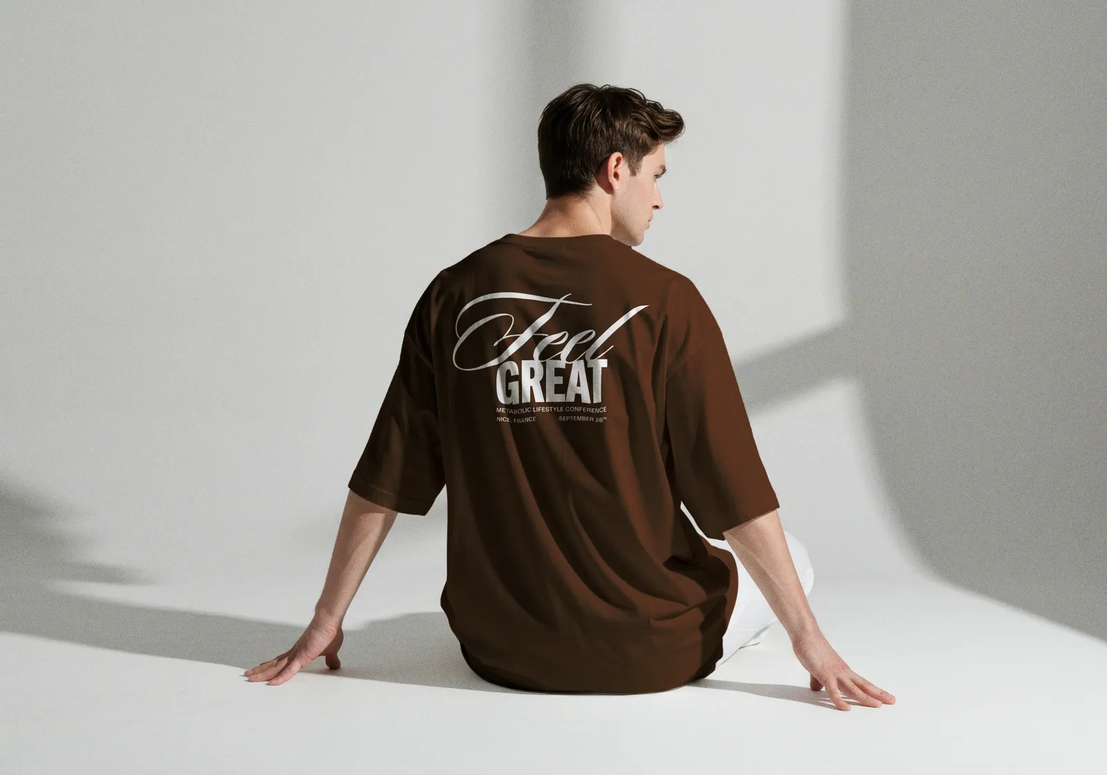
Some of it had never been done in the market. The first fully-animated compensation-plan video — turning a wall of numbers into something people actually watched. An AR experiment that put the product in your own space. And the physical stuff: event booths, standees, banners, presentation decks and Reward-Trip tees that had to hold up in a room, not just a feed.
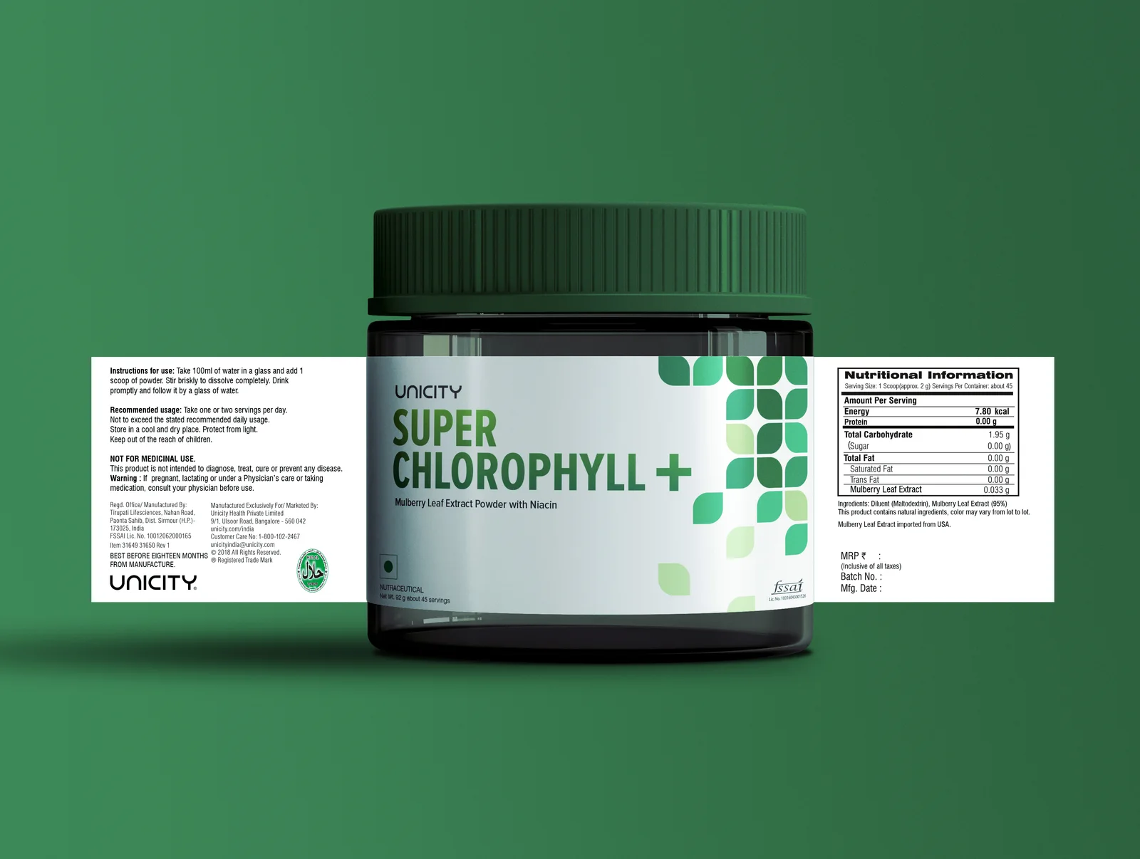
India · Packaging

Down to the jar.
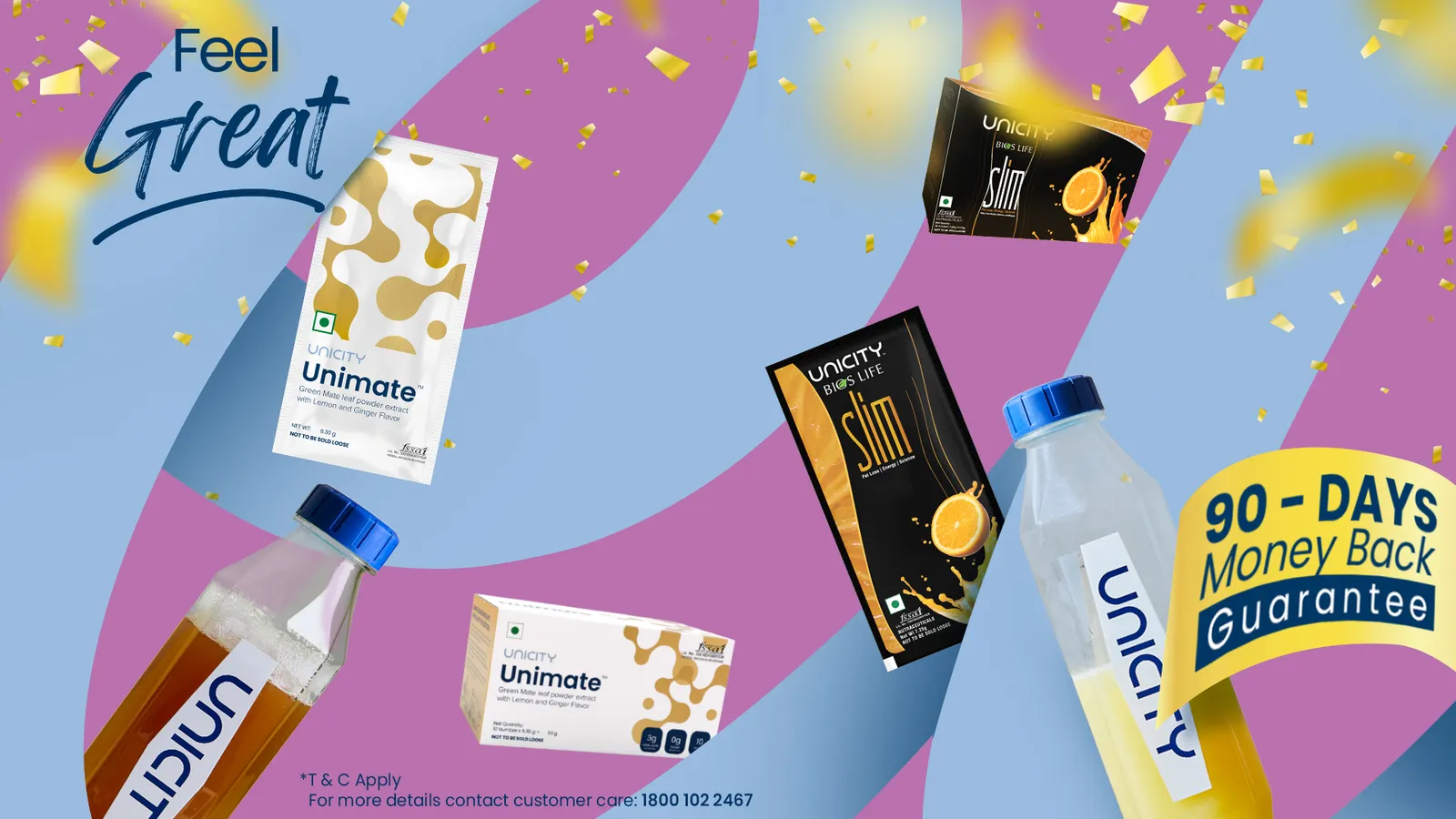
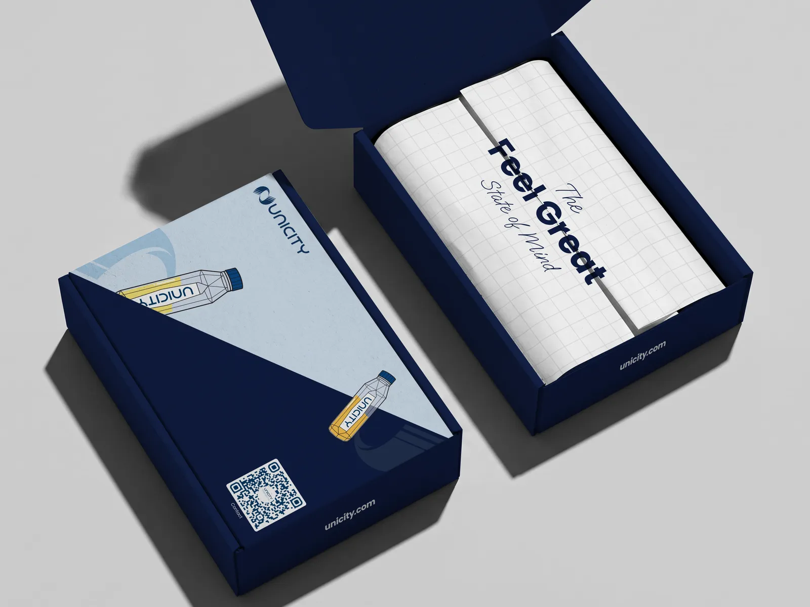
Not everything lives on a screen. In India I designed product packaging that had to survive a shelf and a hand — label systems and panel layouts, signed off against the same global brand book. The hardest, most senior end of the desk: get it wrong and it ships wrong.
2022–Now · Europe
Then Europe called.
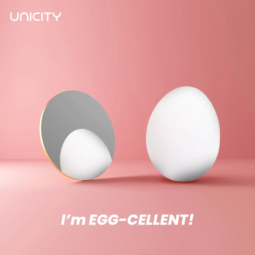
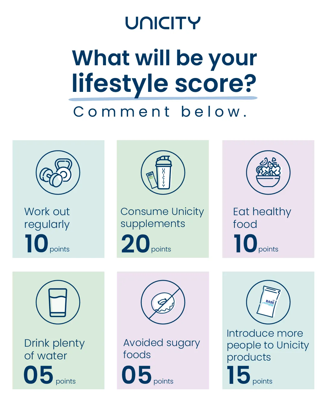
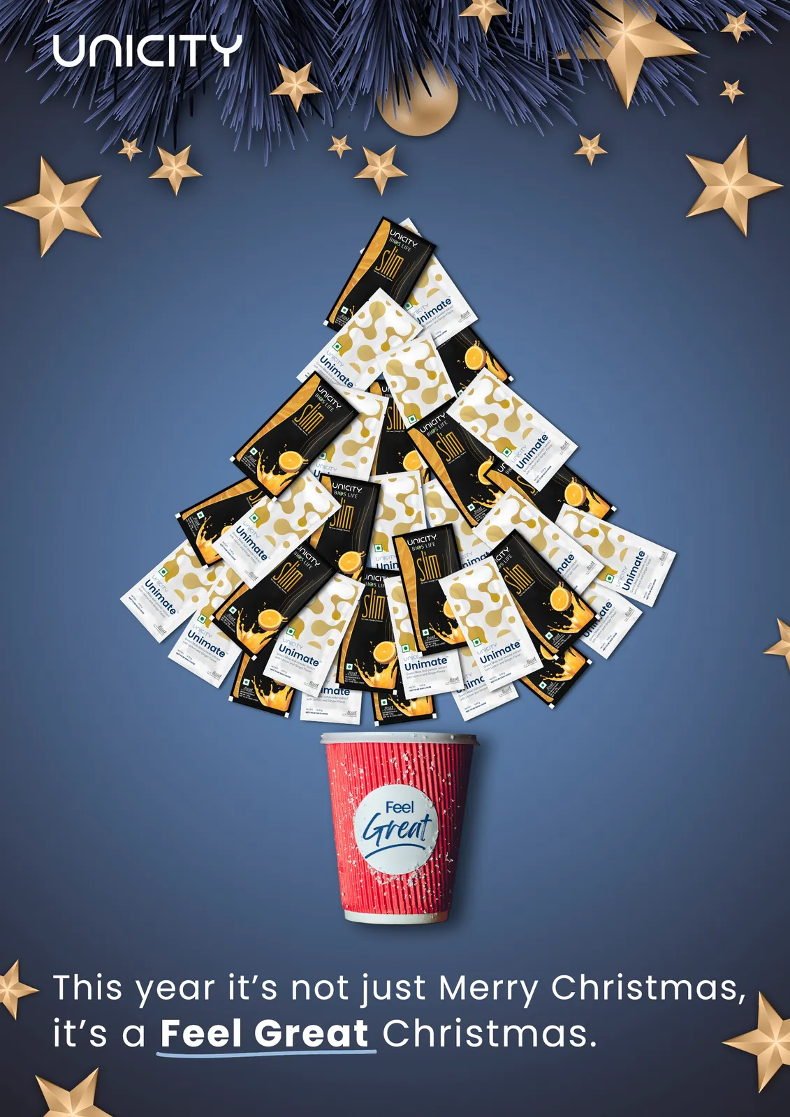
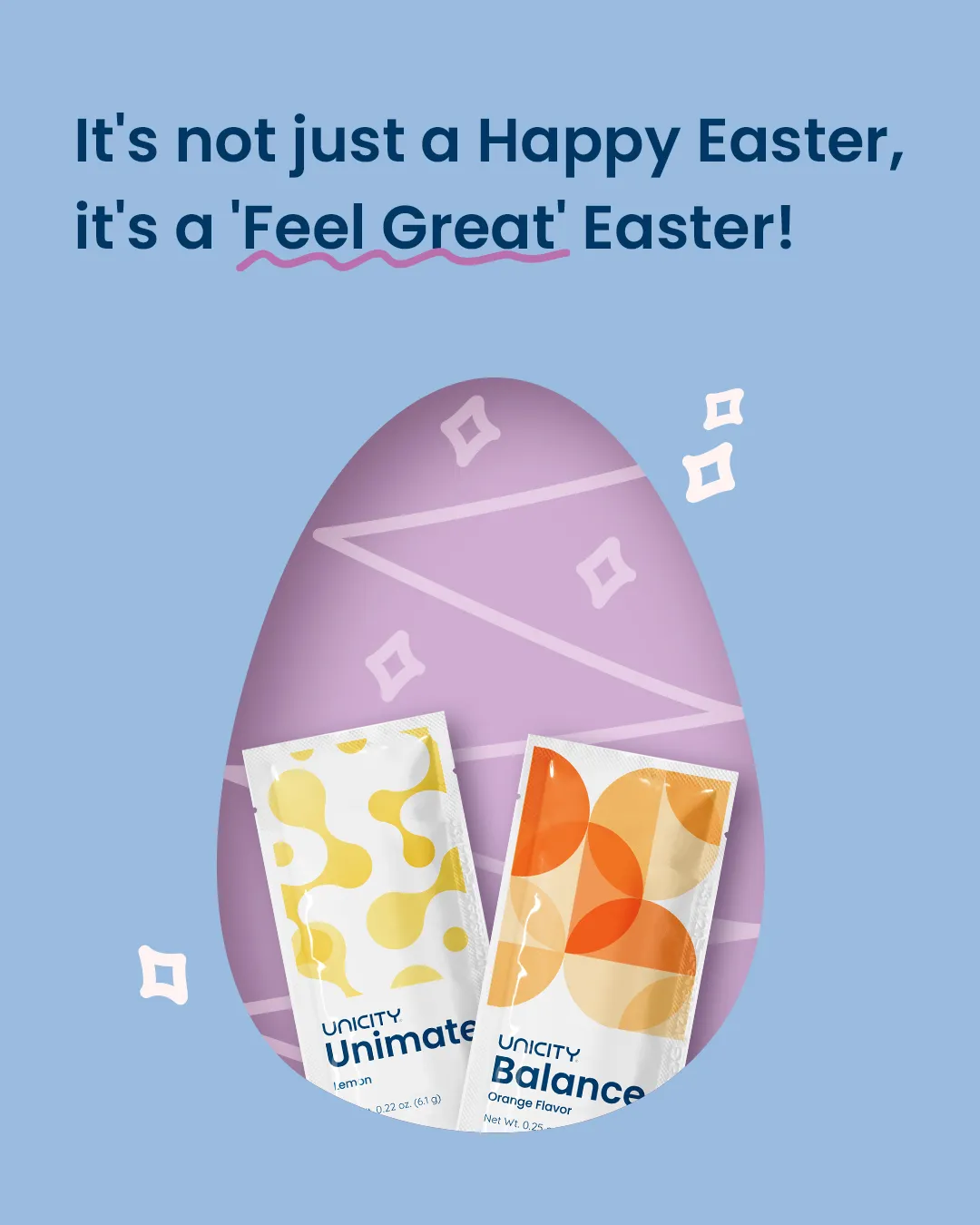
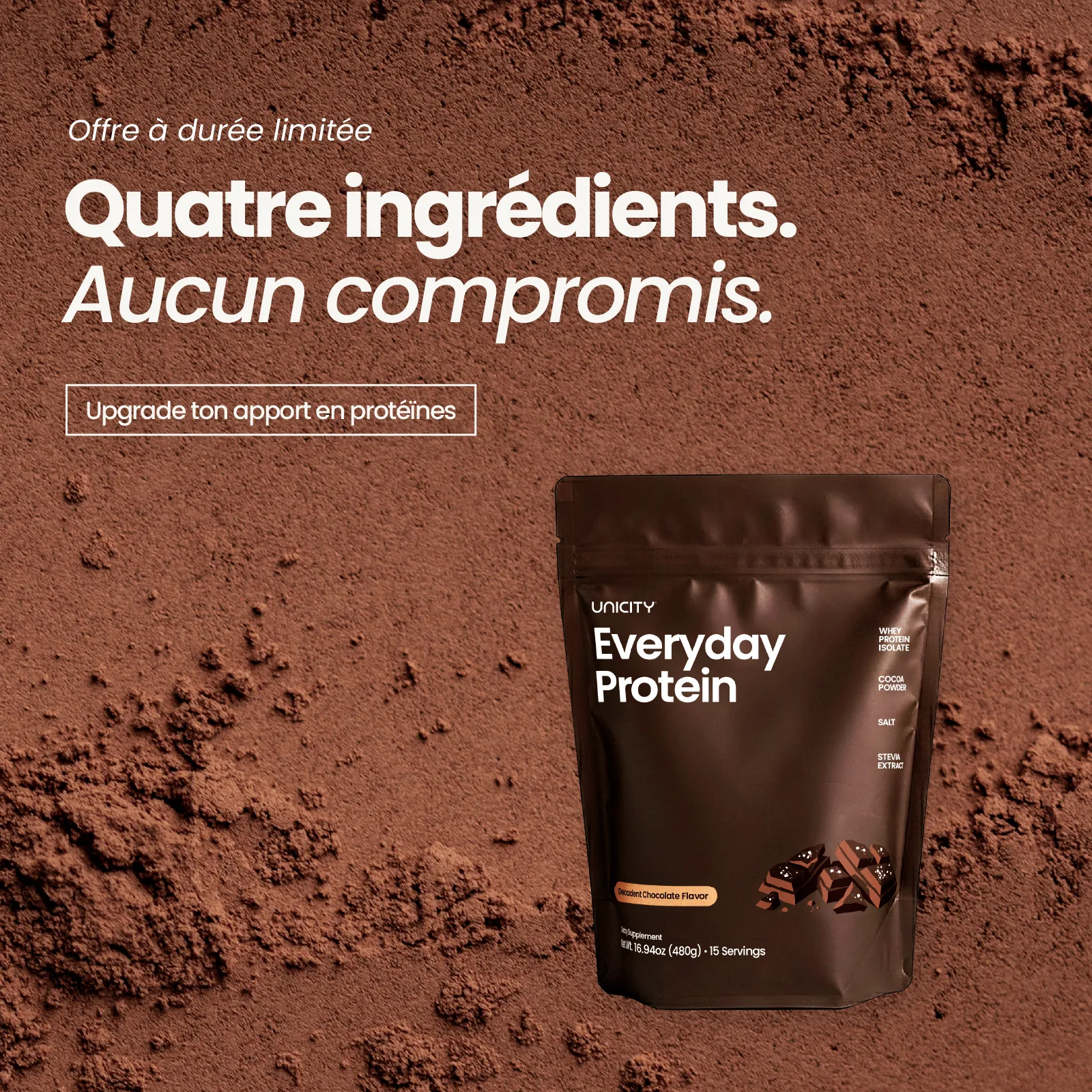
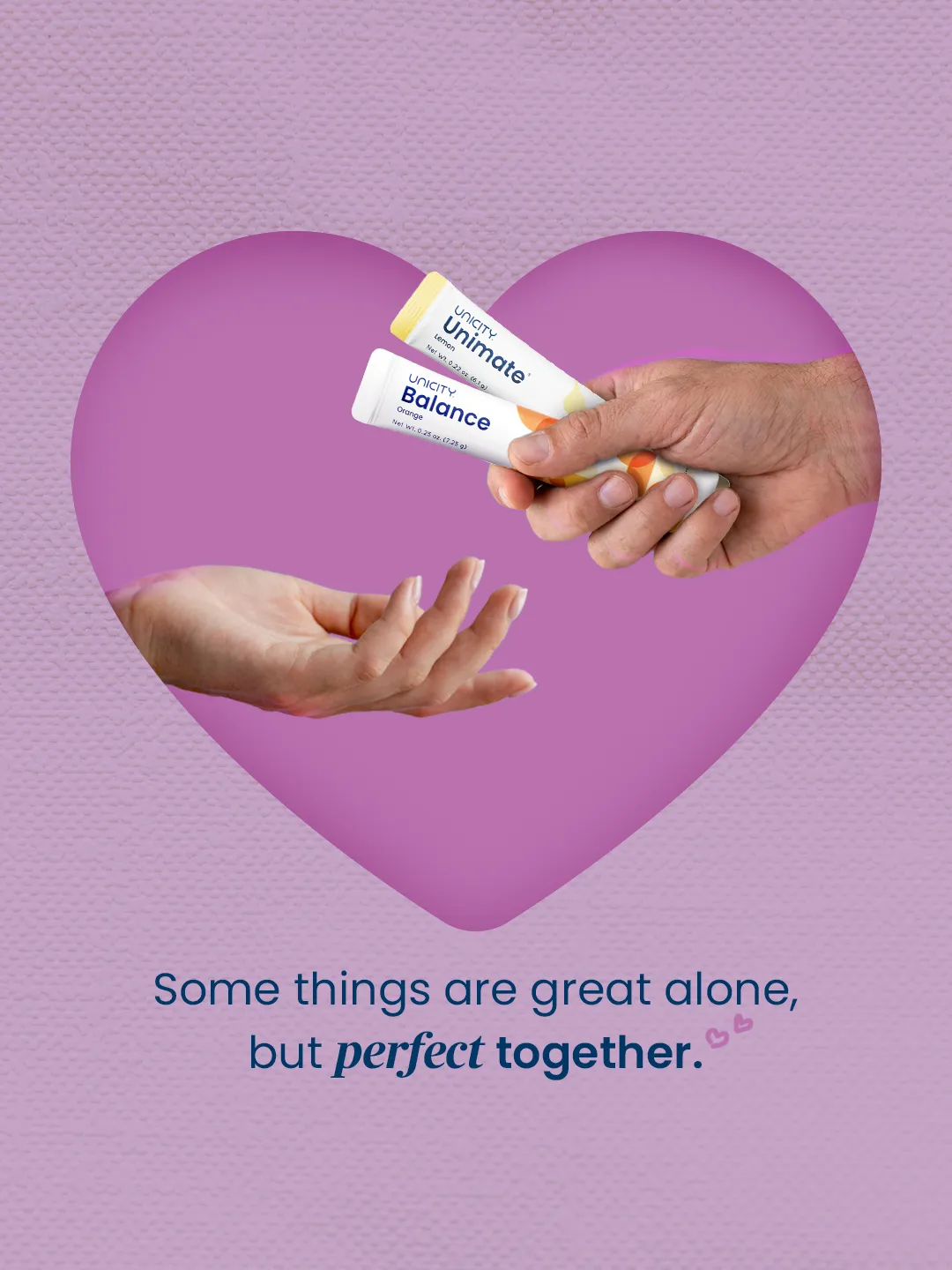
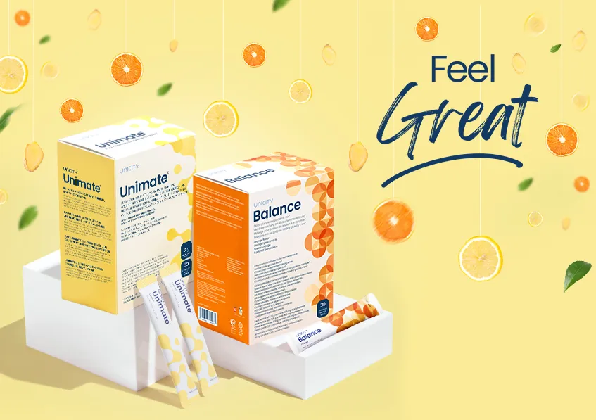
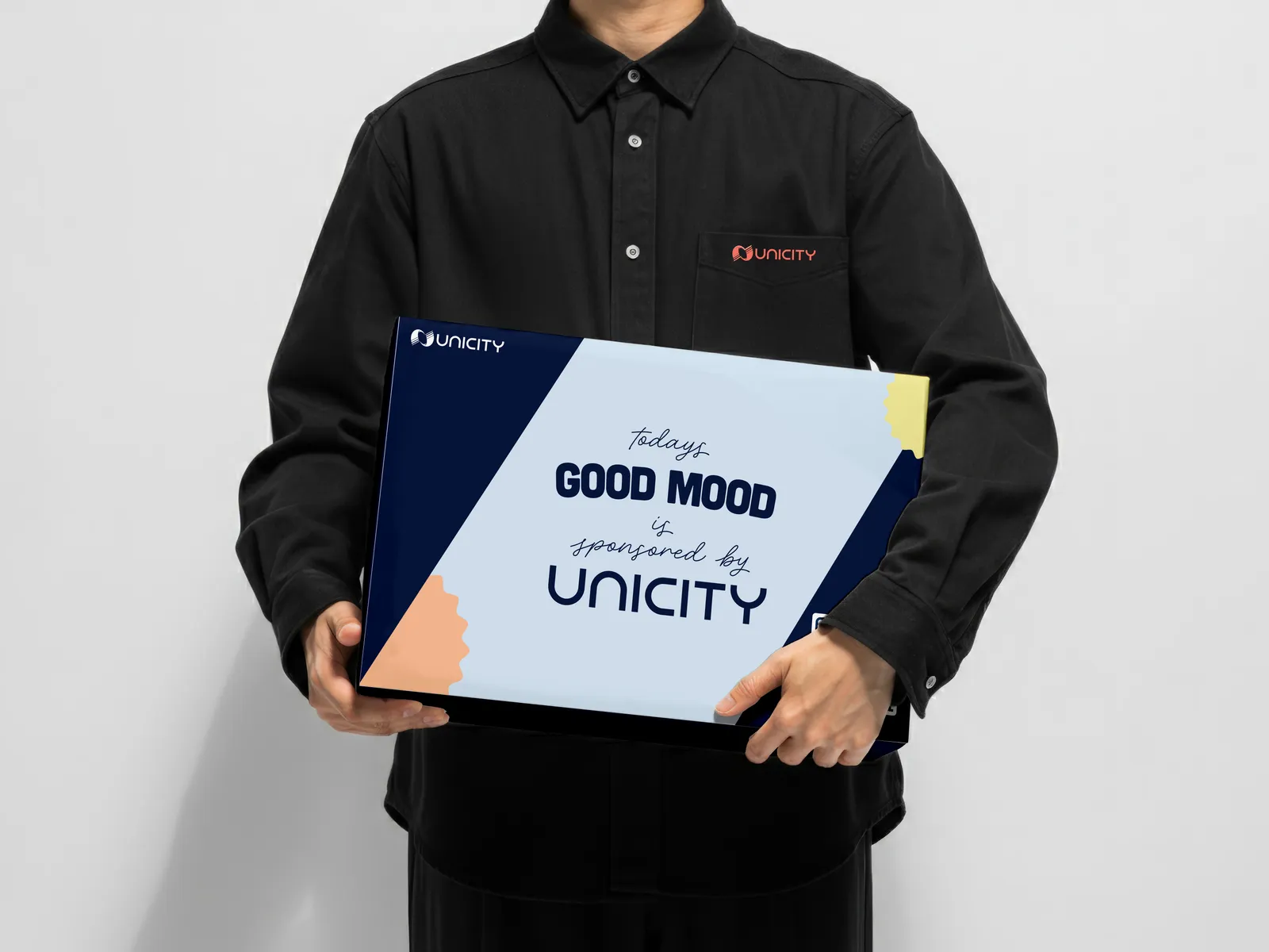
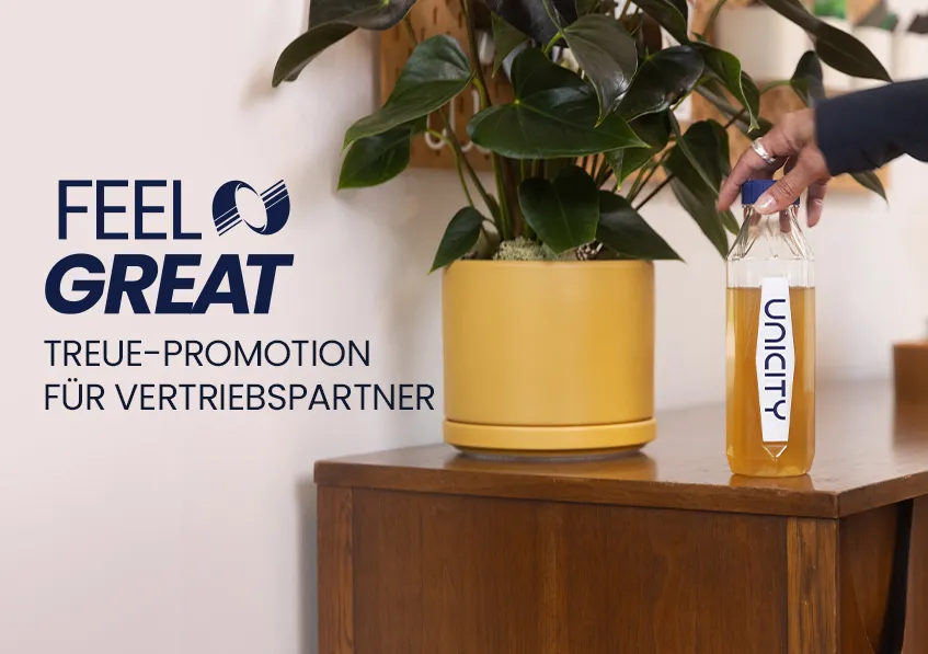
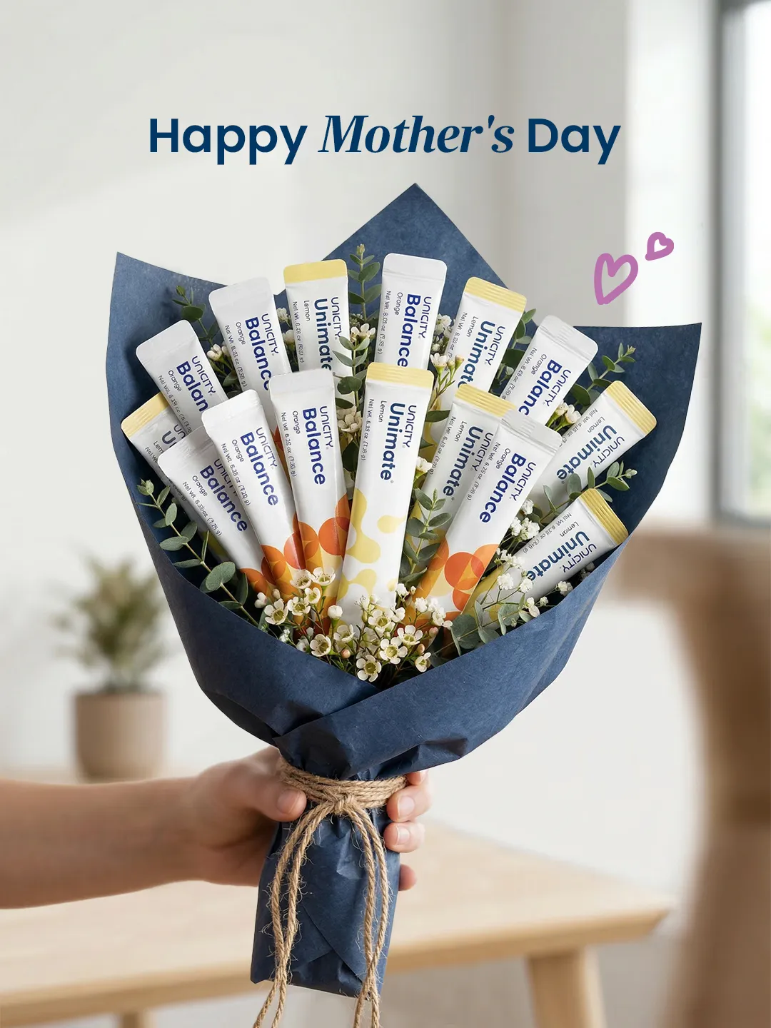
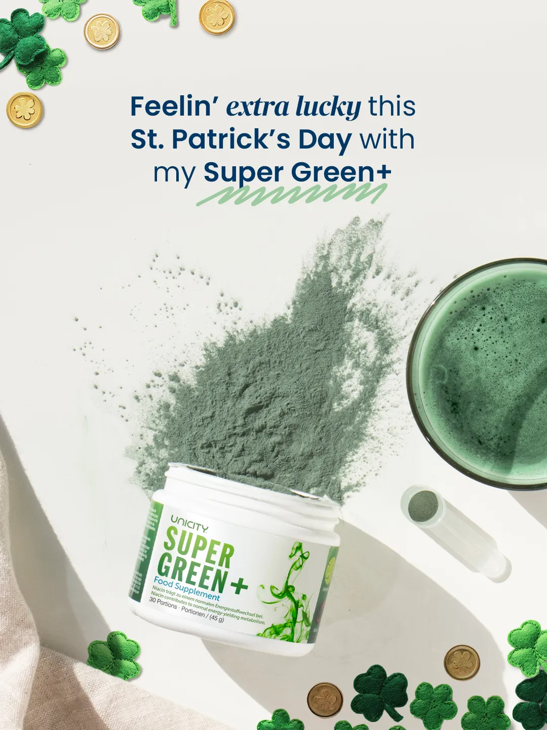
The European team ran at a different volume — a constant feed of posts, carousels and reels across products and campaigns, all held to the same HQ guardrails. This is the day-in, day-out work: fast, on-brand, and consistent enough that nobody could tell it came from a desk three time-zones away.
Holiday Campaign
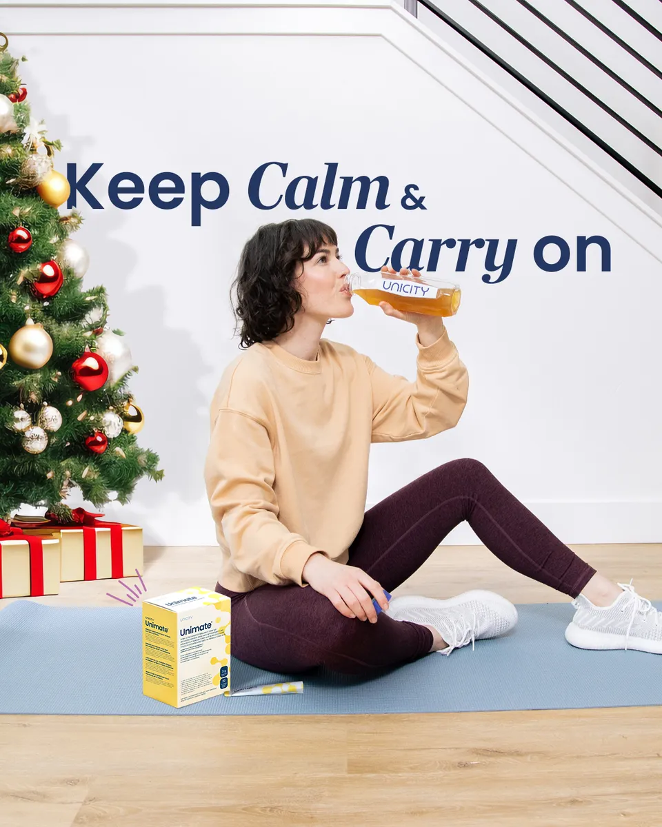
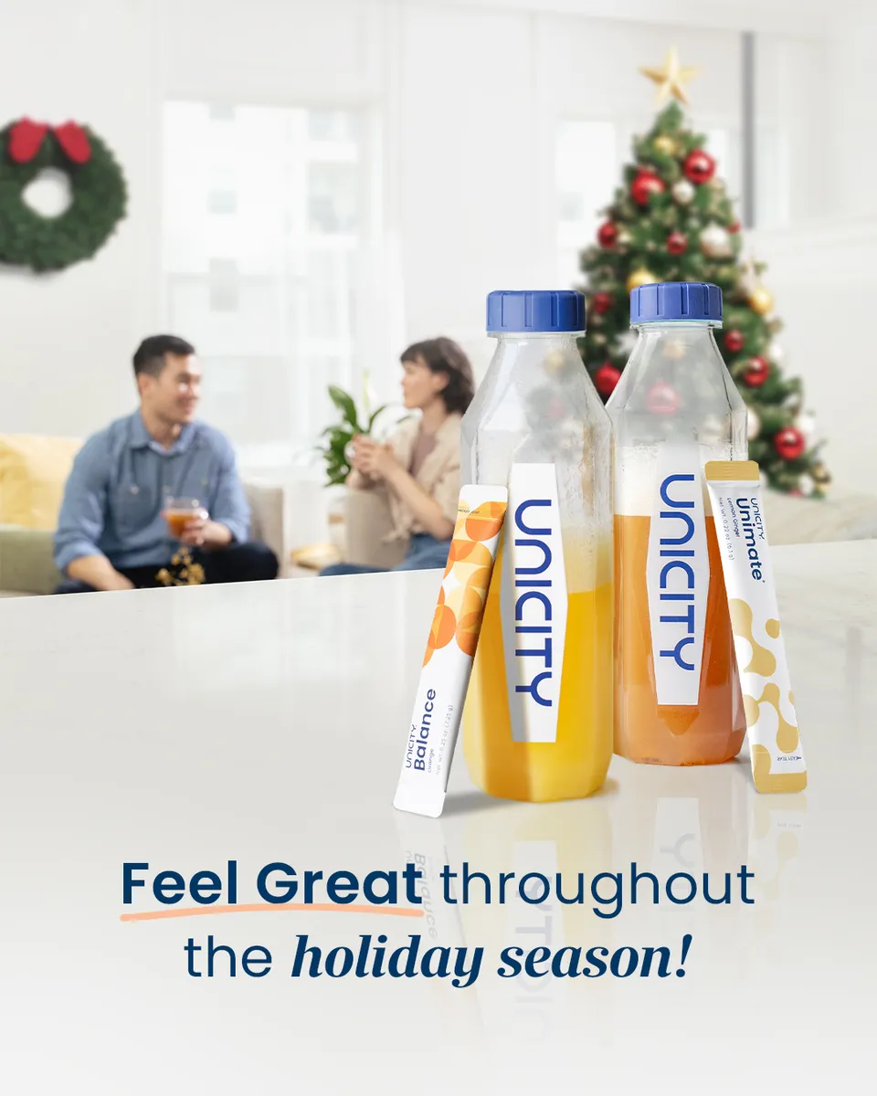
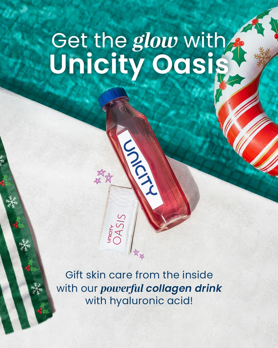
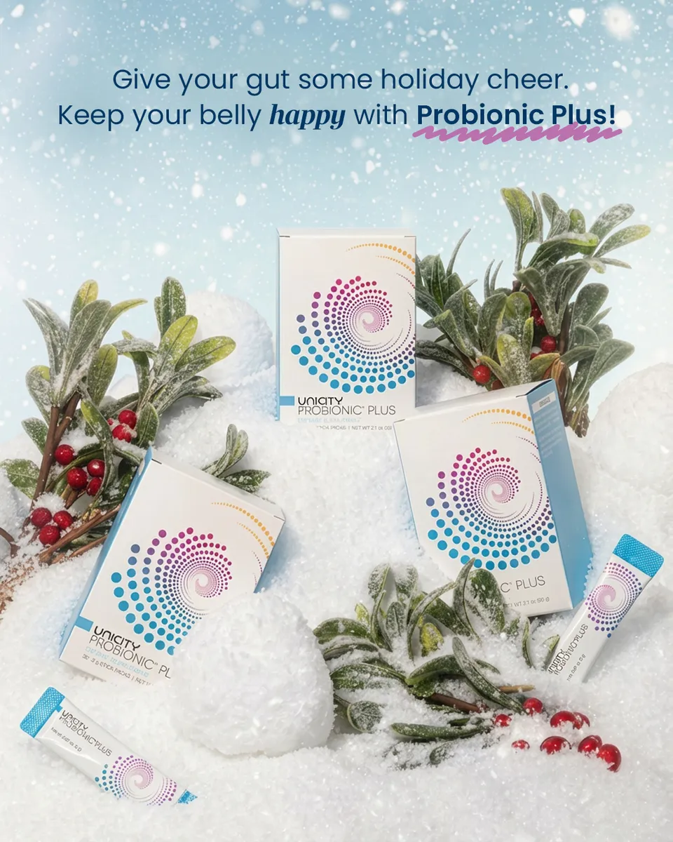
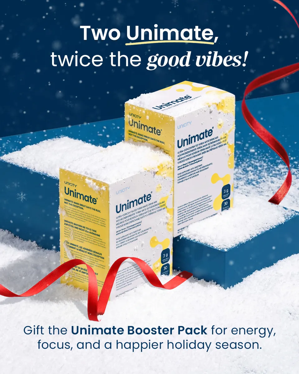
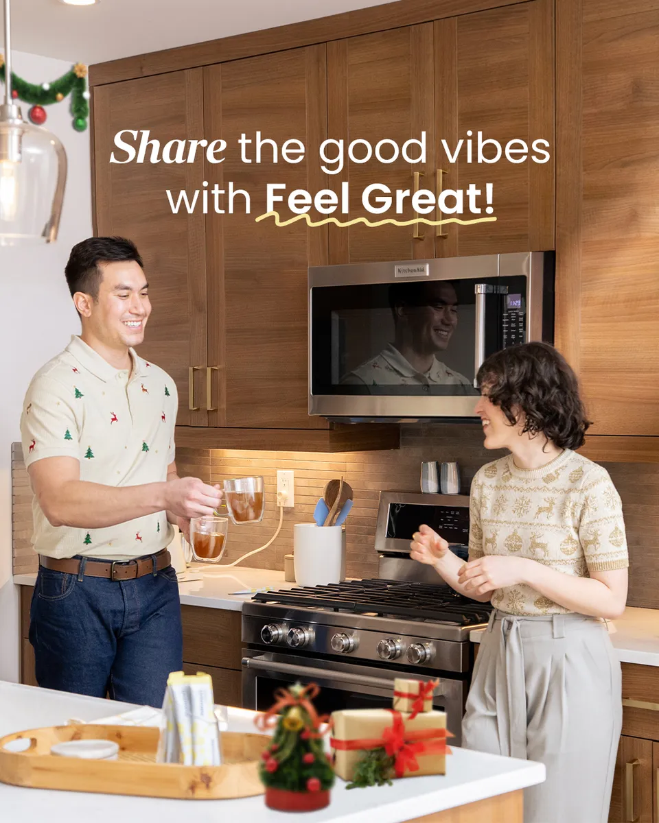
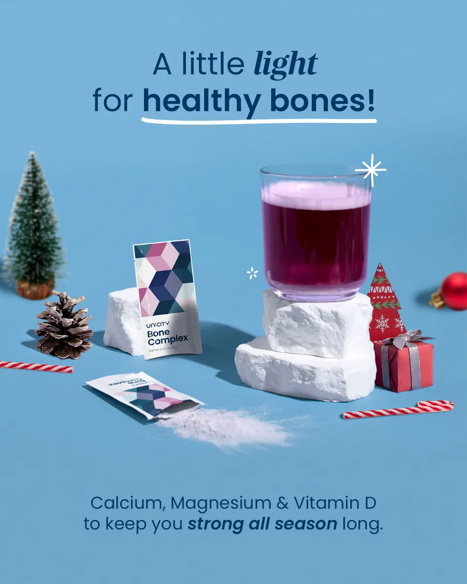
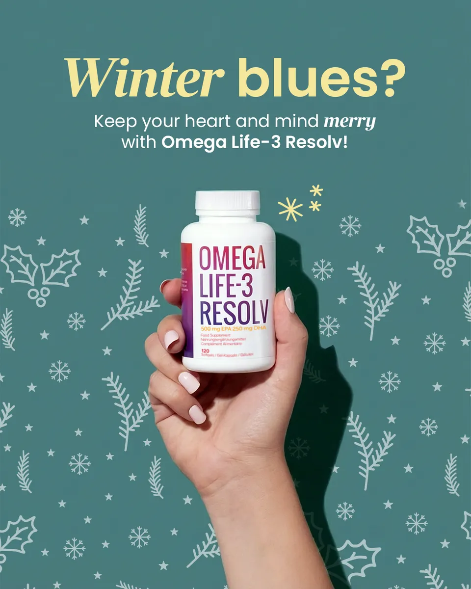
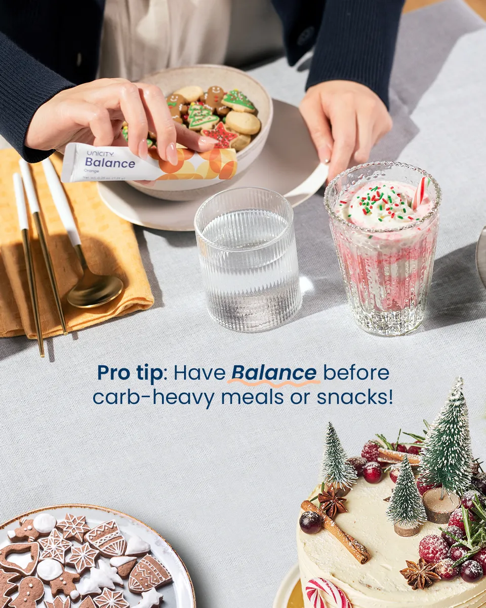
24 days, one brand voice.
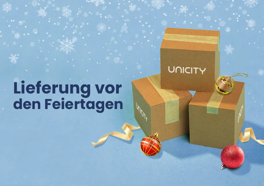
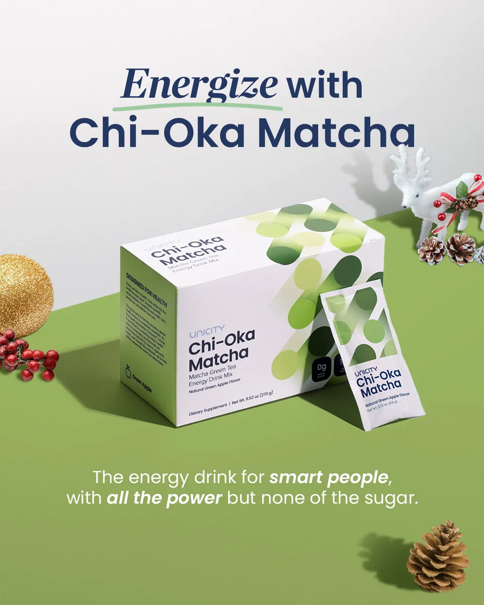
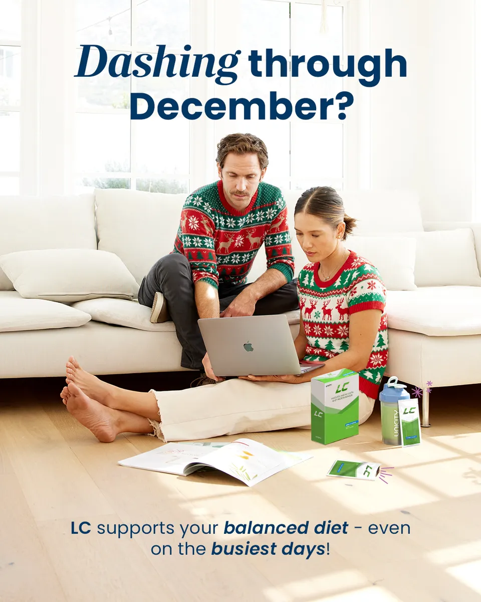
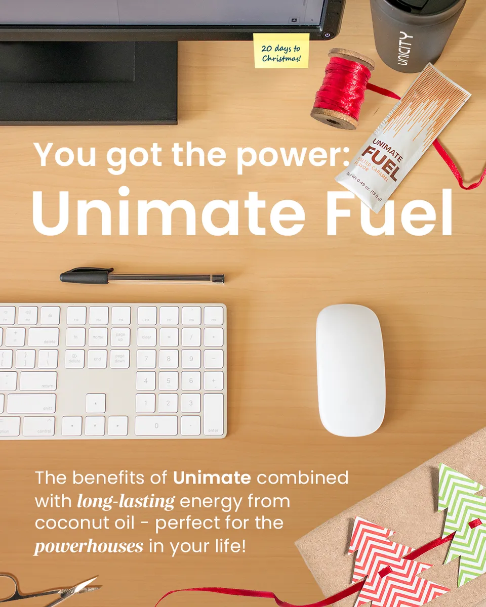
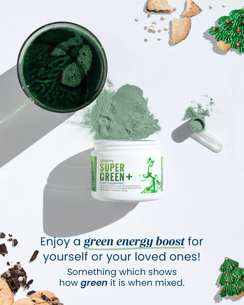
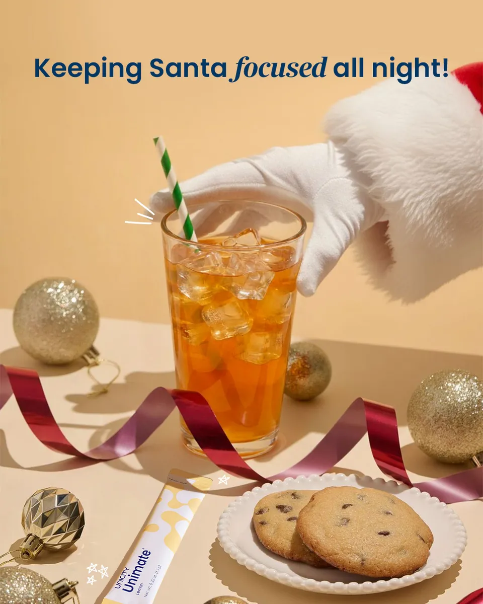
A full advent calendar for Europe — a piece a day through December, each a different product but the same warm, unmistakable Unicity holiday feel. A campaign you feel by scrolling, not studying.

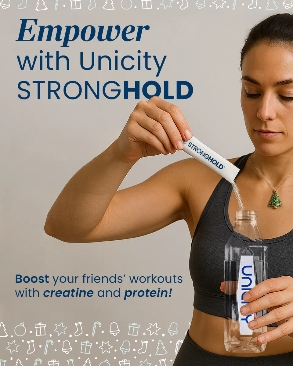
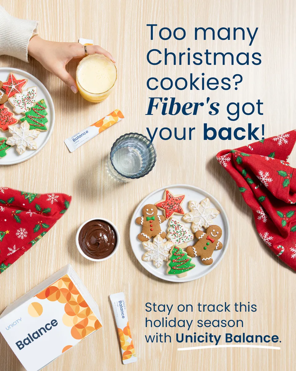
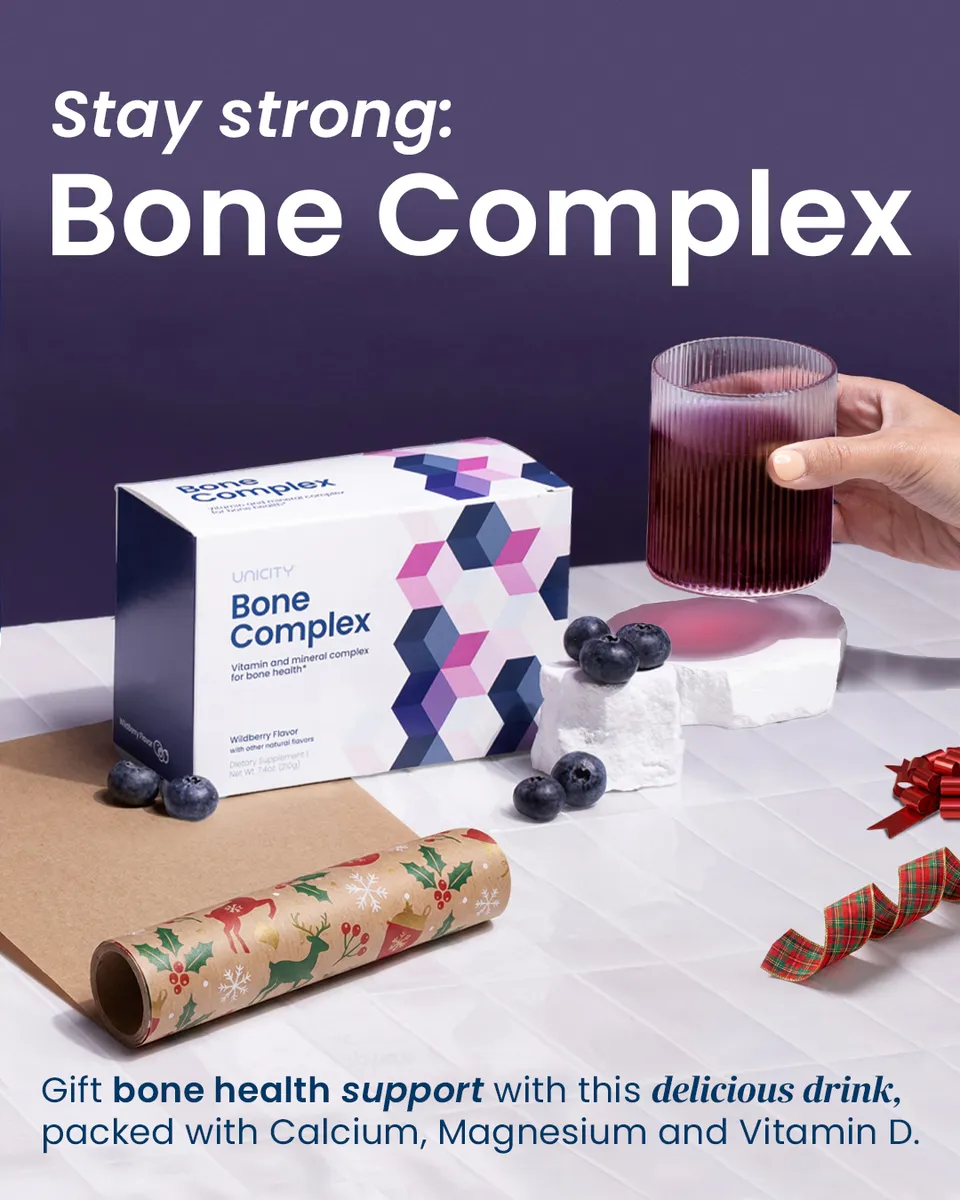
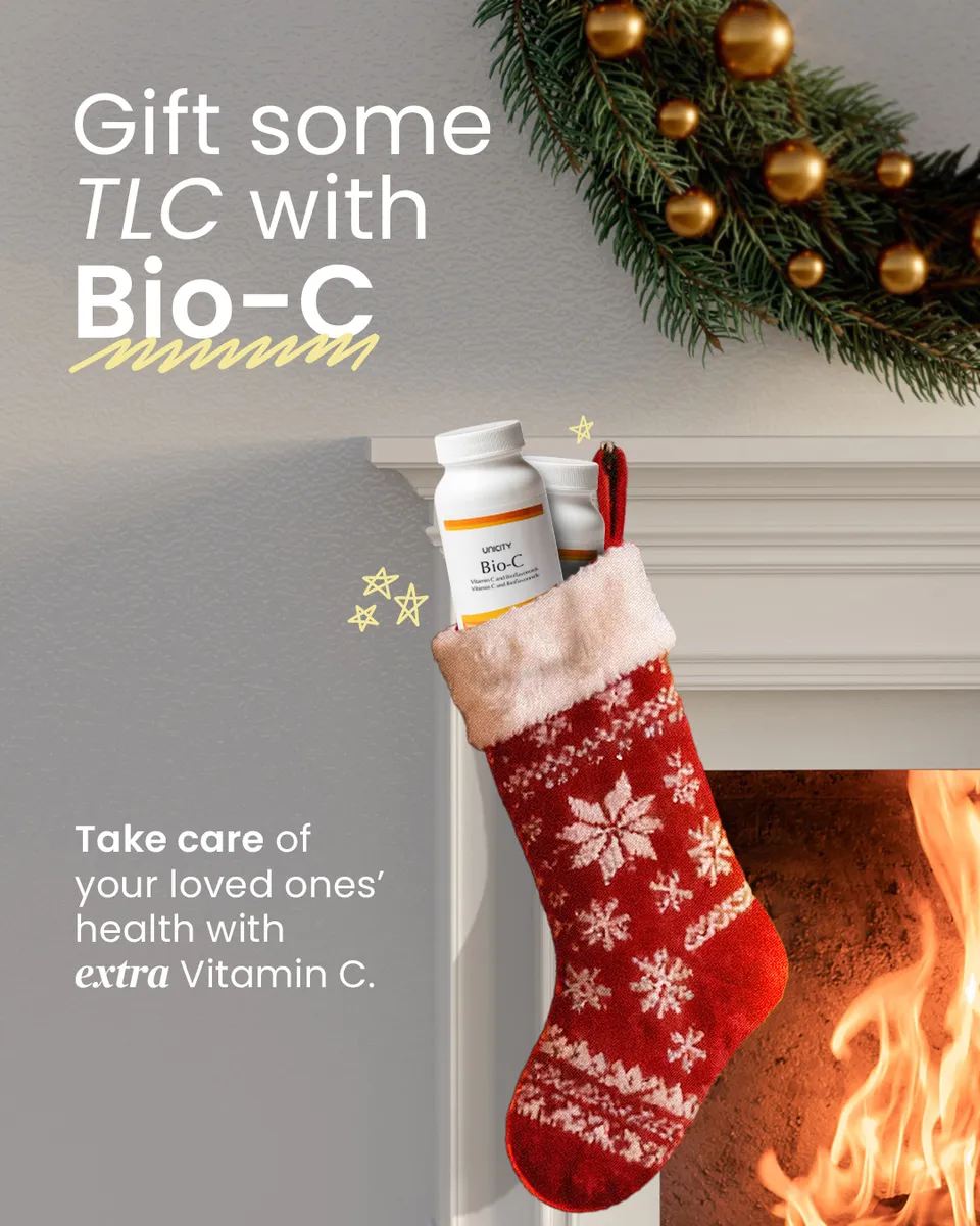
One brand, many languages
Same brand, every alphabet.
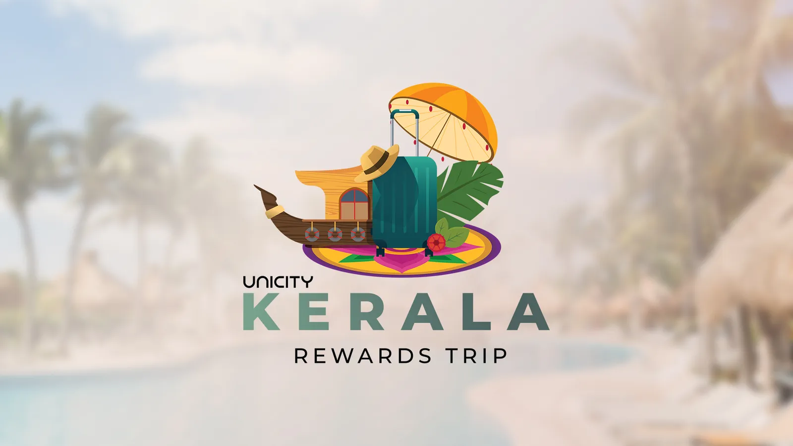
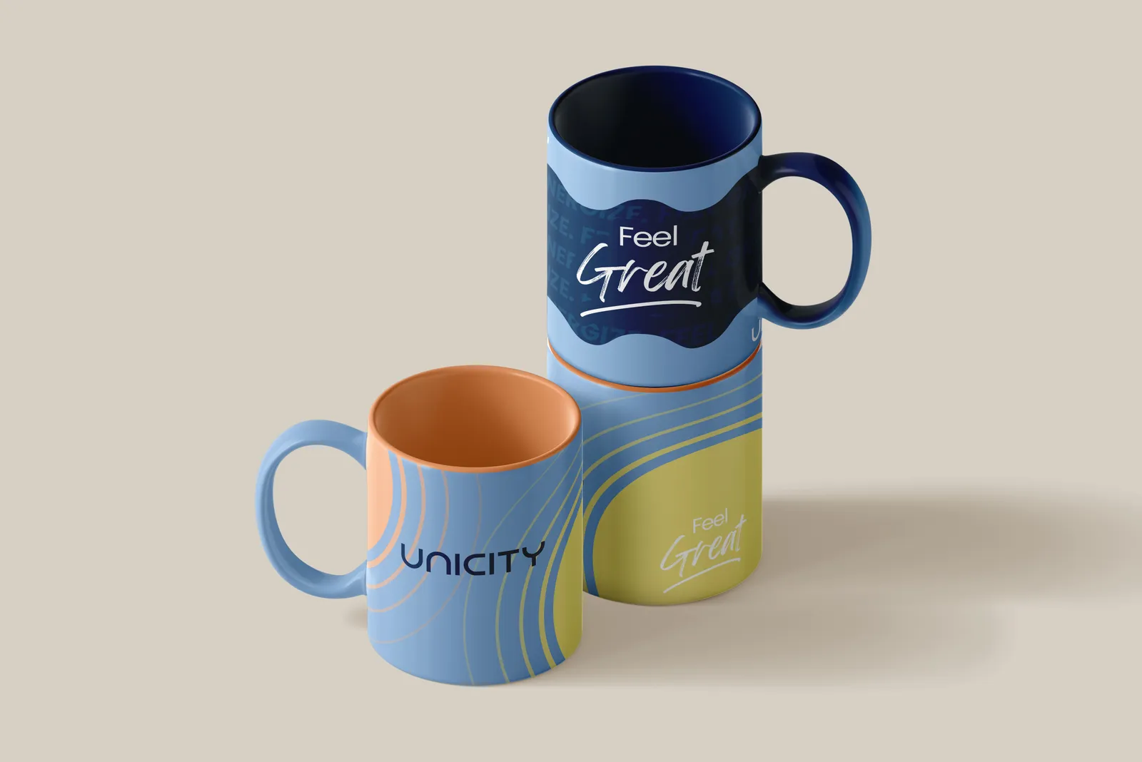






The truest test of a global brand: does it still feel like itself in another language? The Korea Reward-Trip itinerary shipped in English, French and Arabic — same system, three scripts — and the Middle East work carried the mark onto event logos and merch. One brand book, translated by hand, region to region.
Middle East · Event logos & merch
Running the desk
Seven years, still counting.
This isn't a project — it's the through-line of my career. Seven-plus years in-house, three regions, and a run leading the India design bench — four designers in total, two at a time at peak. The kind of longevity and trust you only earn by being the person the brand can hand anything to.