
 Brand Identity · Social · Motion — 2025–2026
 Limitless Boxing
A boxing gym that was ready to grow — but their brand wasn't keeping up.
The Mark
Movement before power.
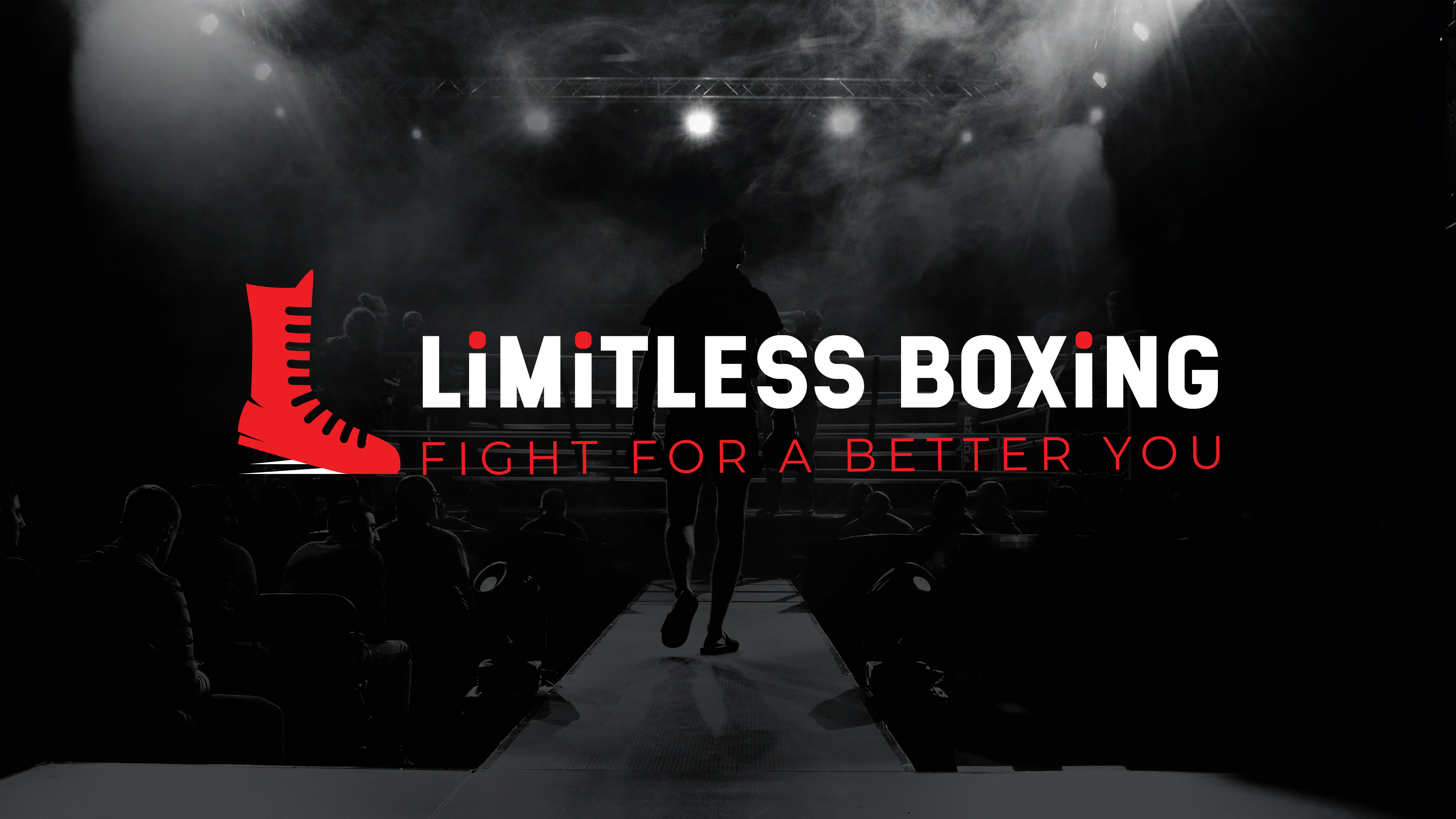
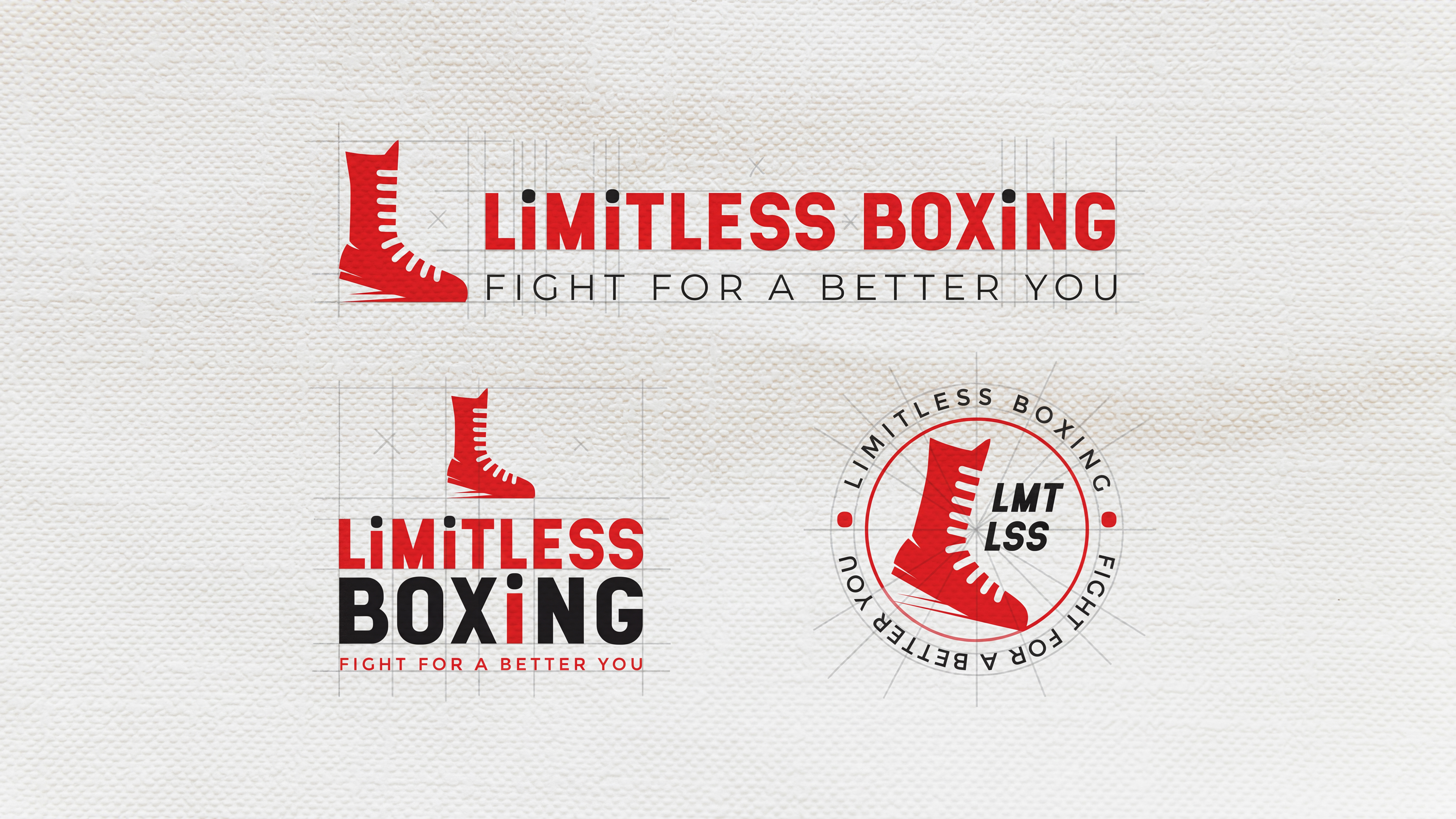
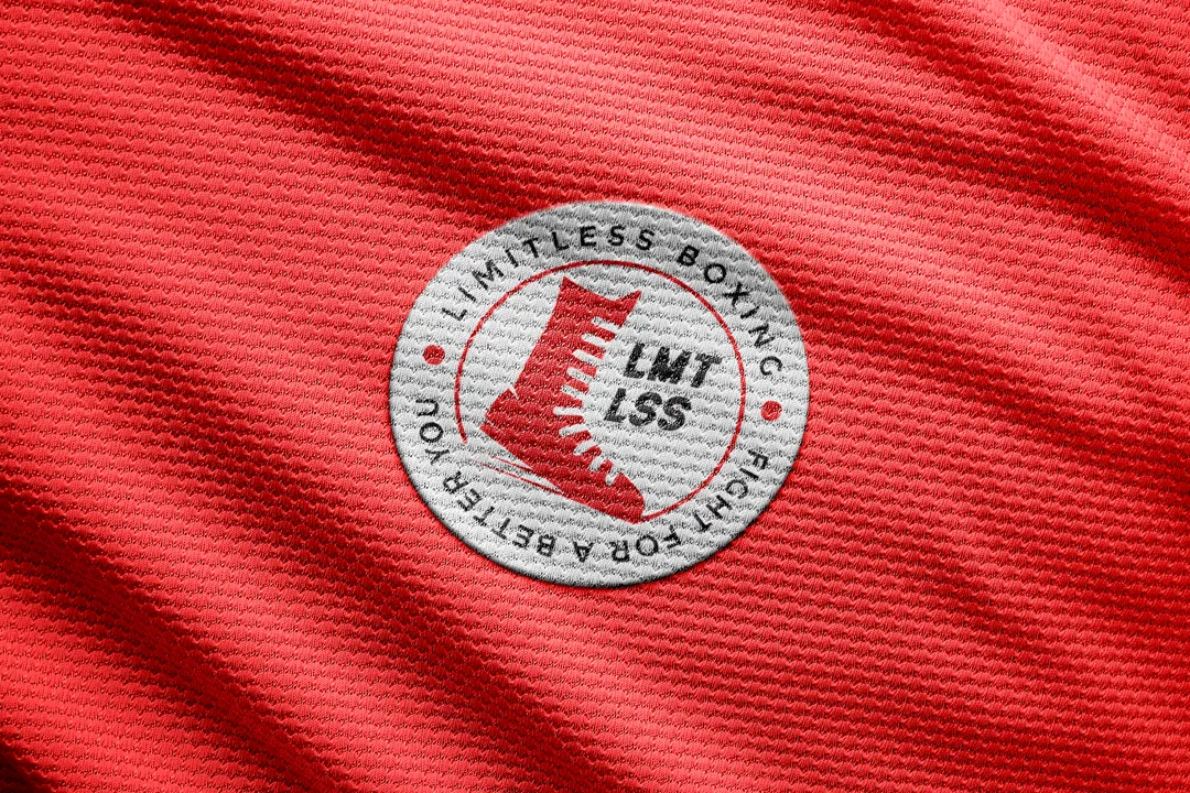
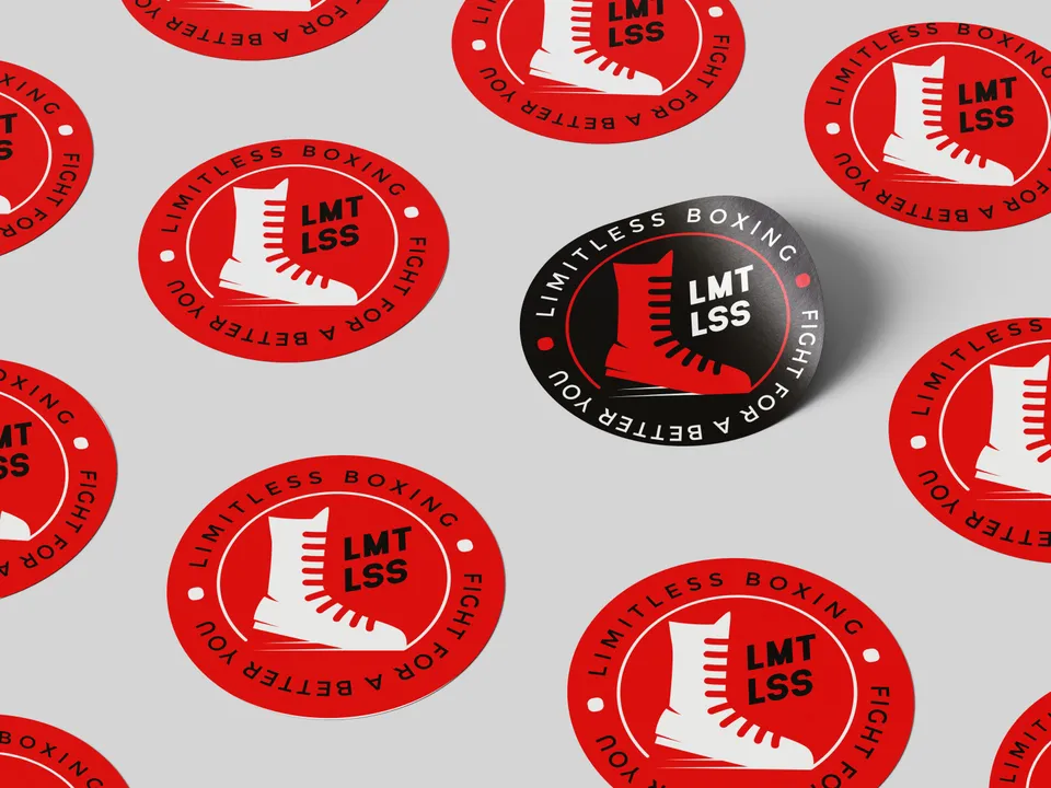
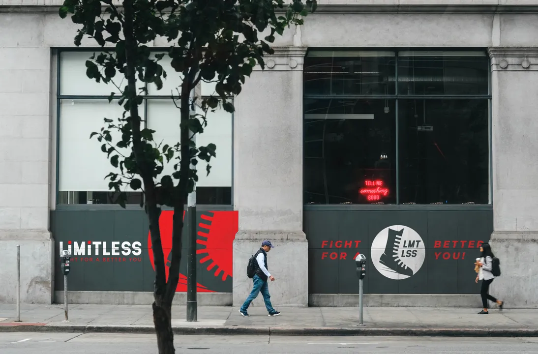
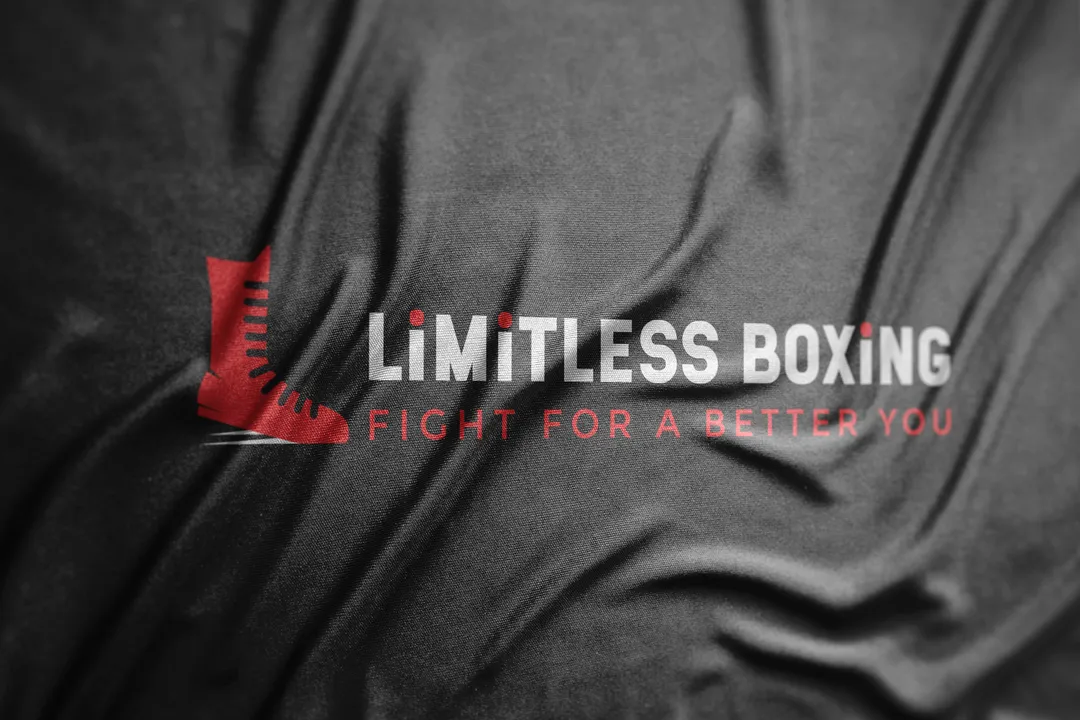
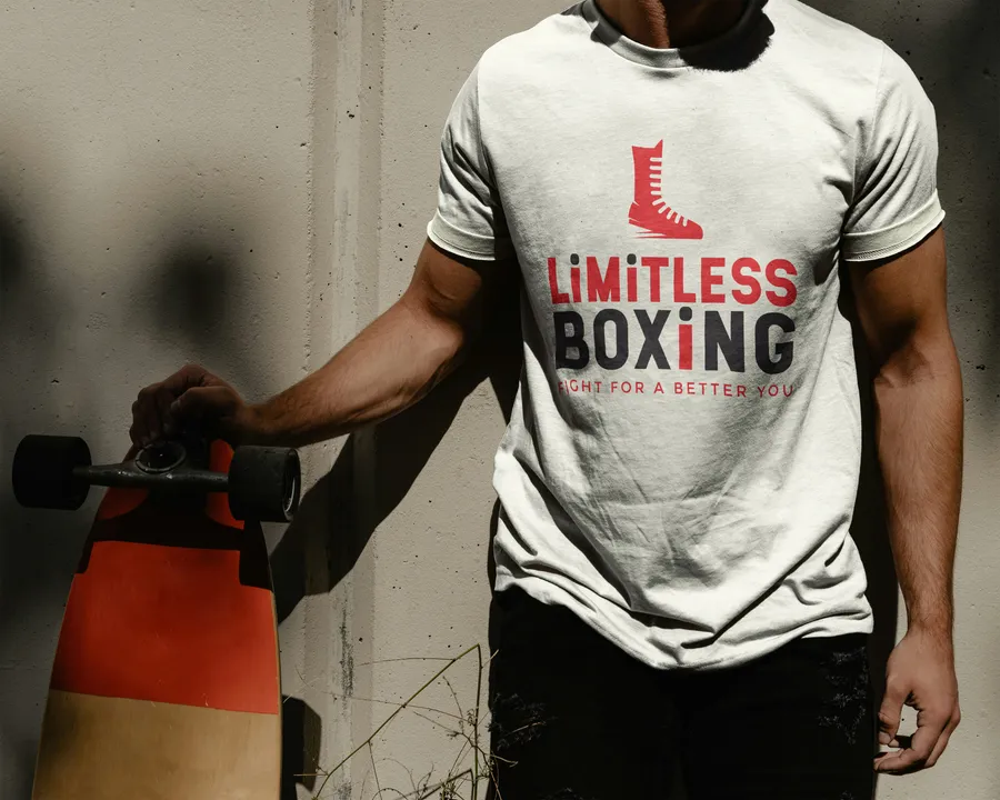
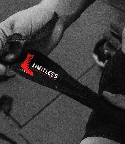
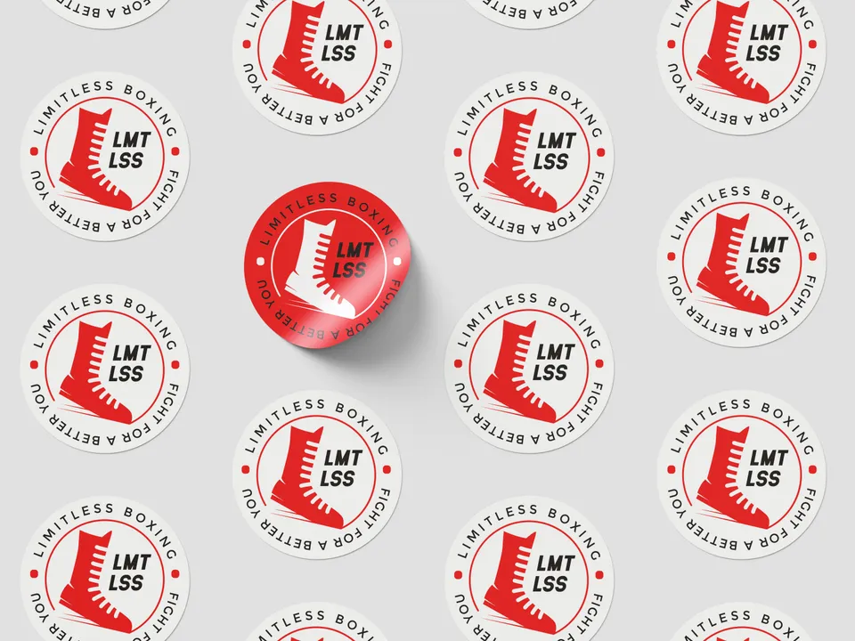
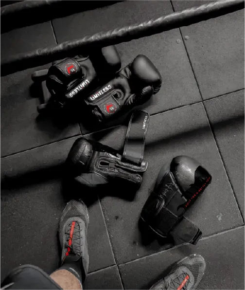
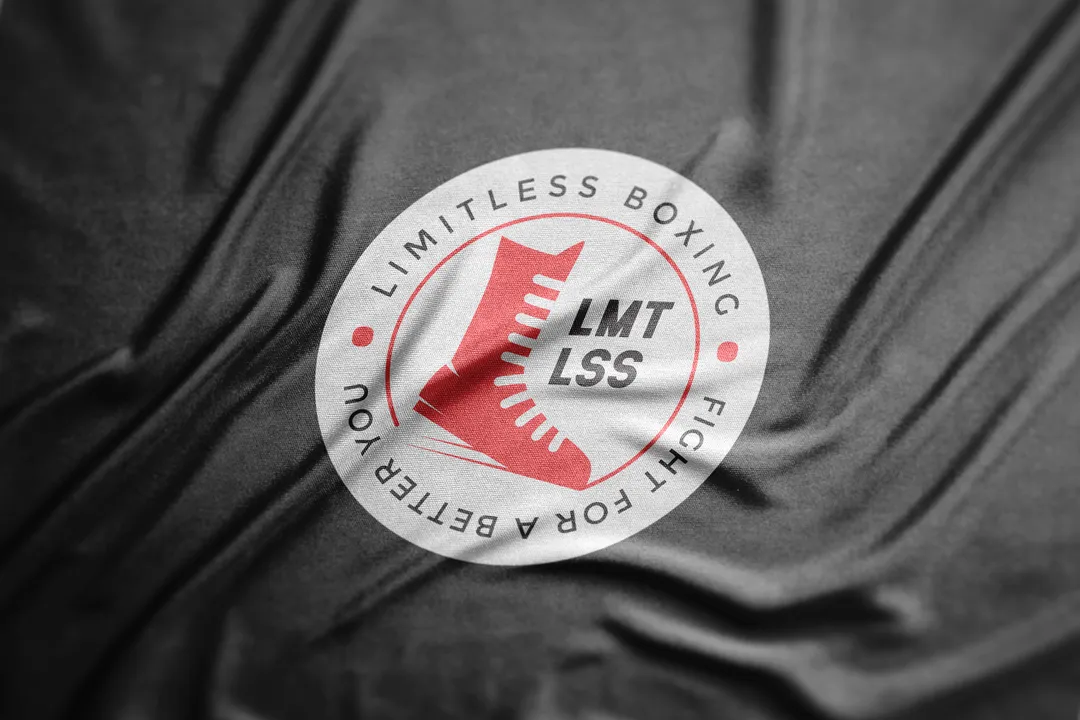
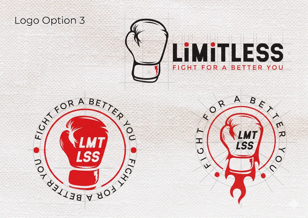
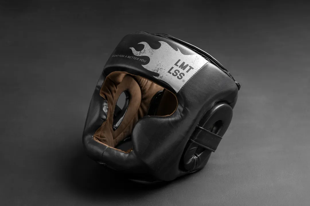
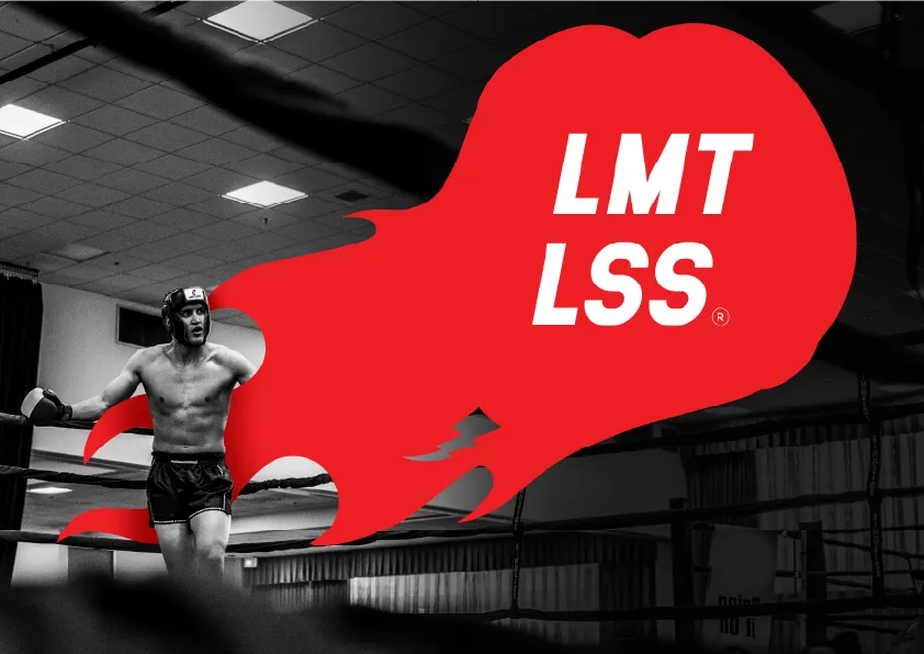
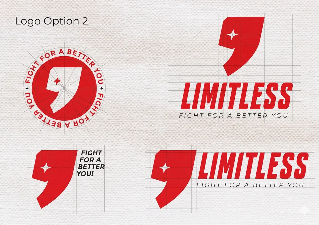
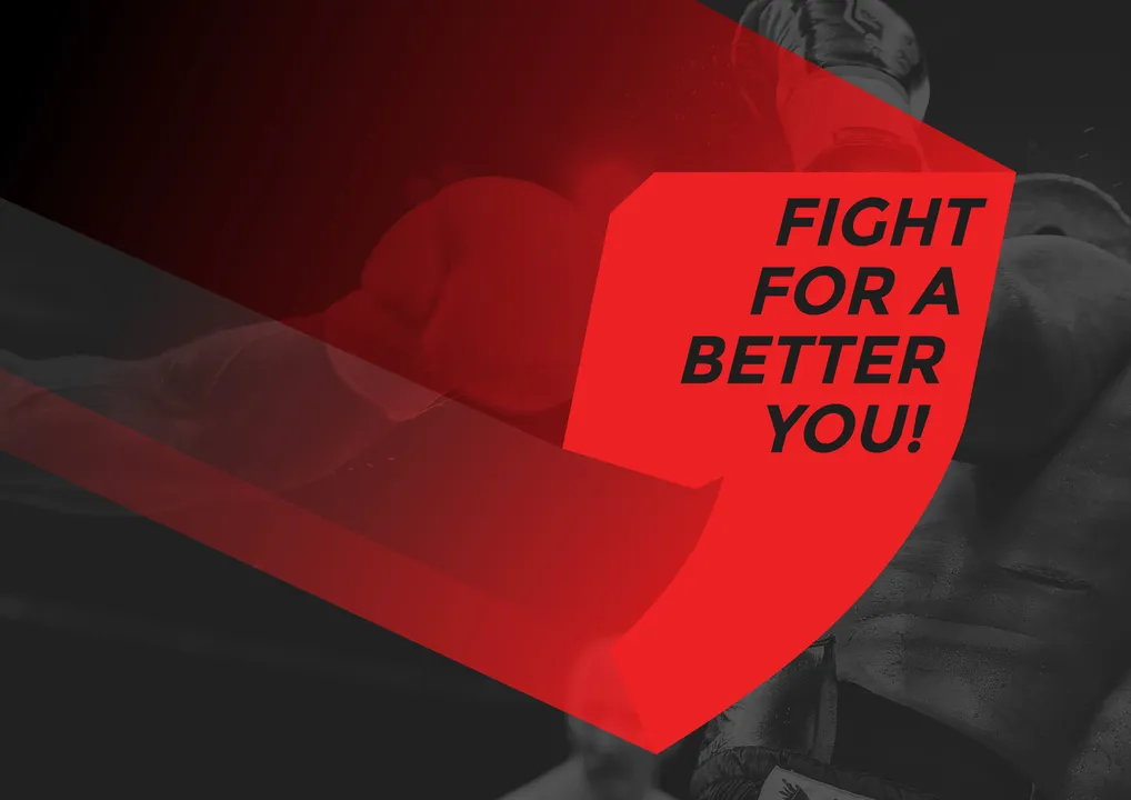
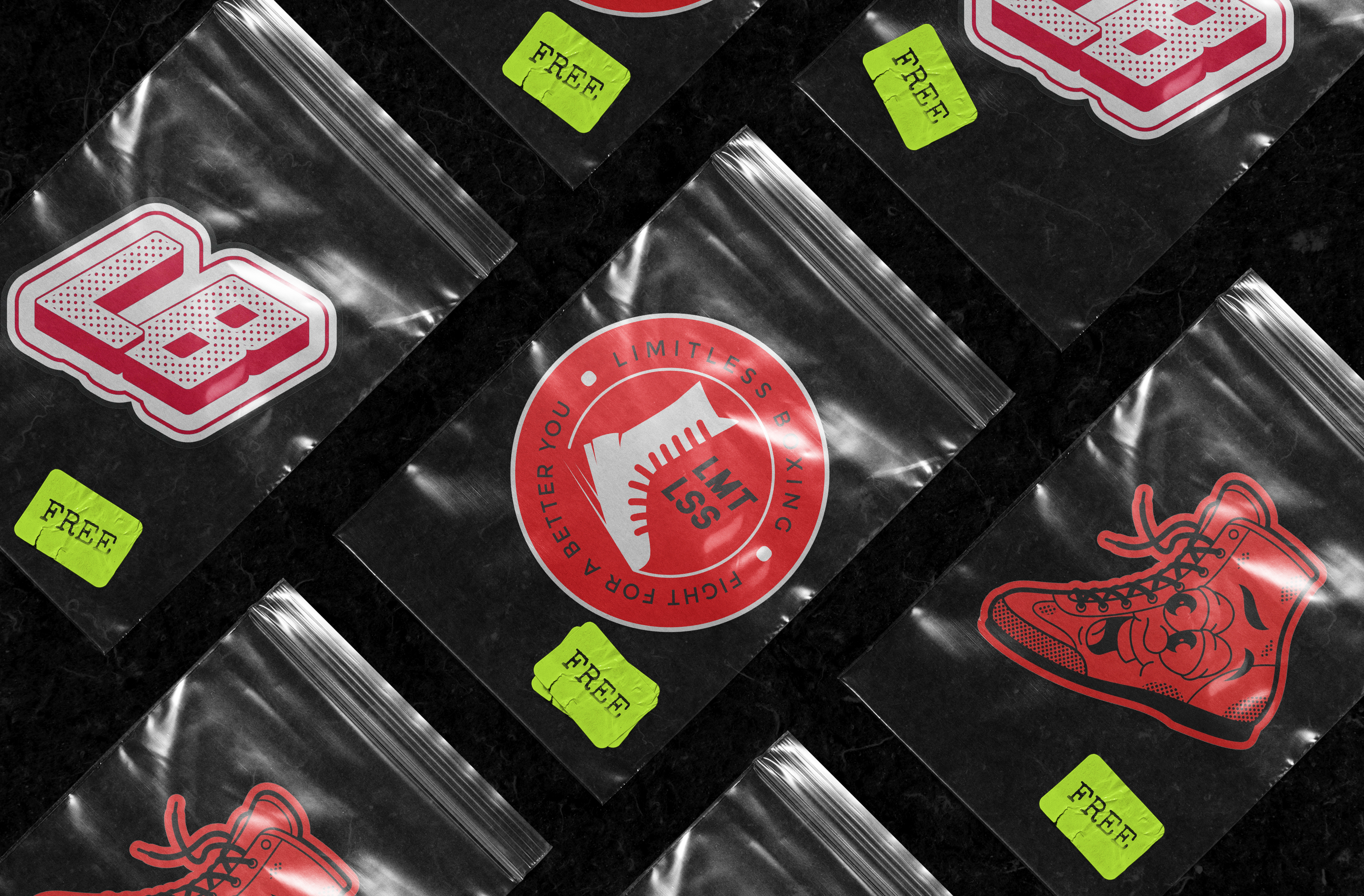
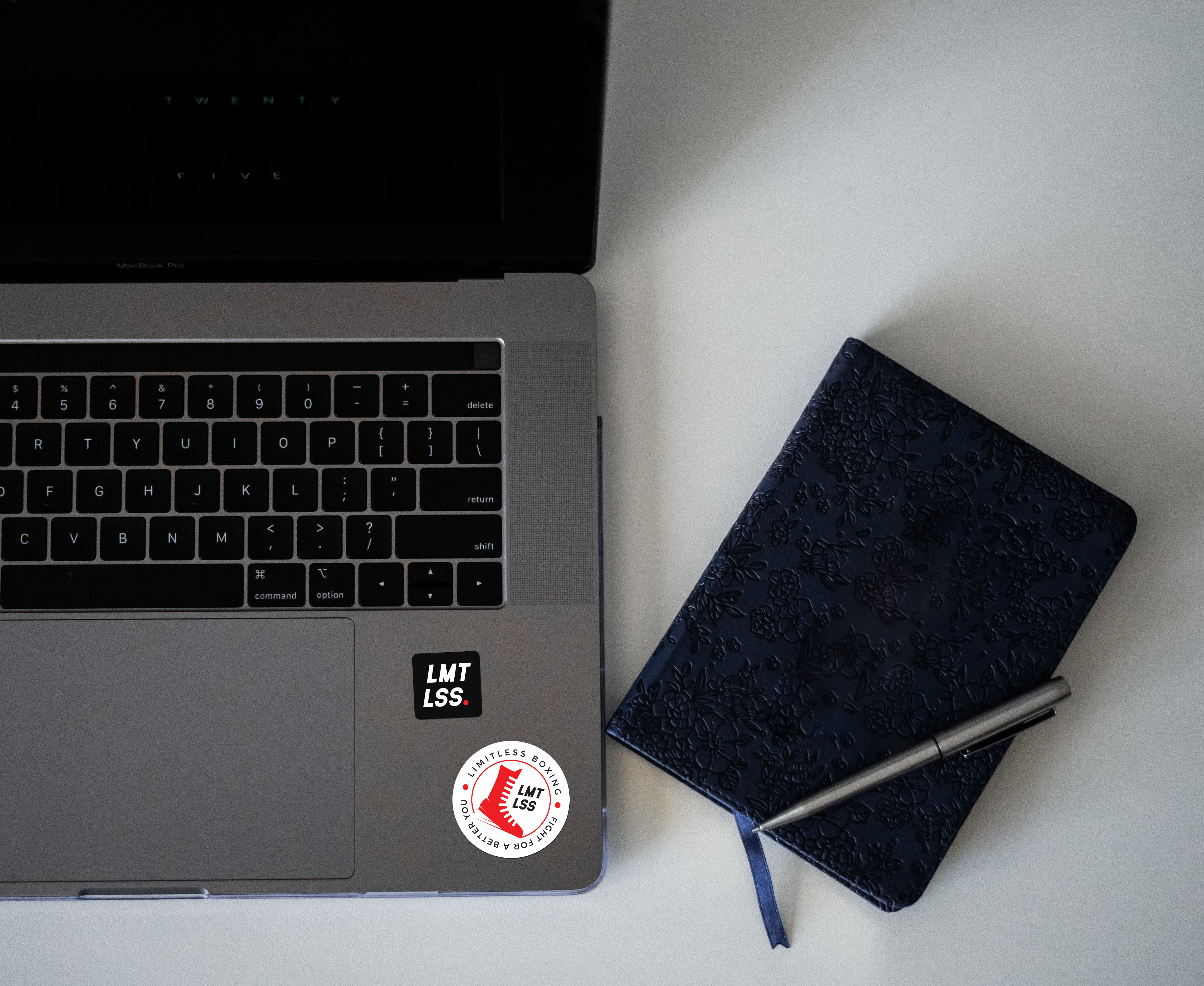
Most boxing brands lean on gloves. Limitless wanted something different — so the mark is built around a boxing shoe, a nod to footwork being the foundation of the sport. The variations span horizontal lockups, stacked marks, and a monogram for tight spaces — same identity, different scenarios.
Social
From posting to pulling.
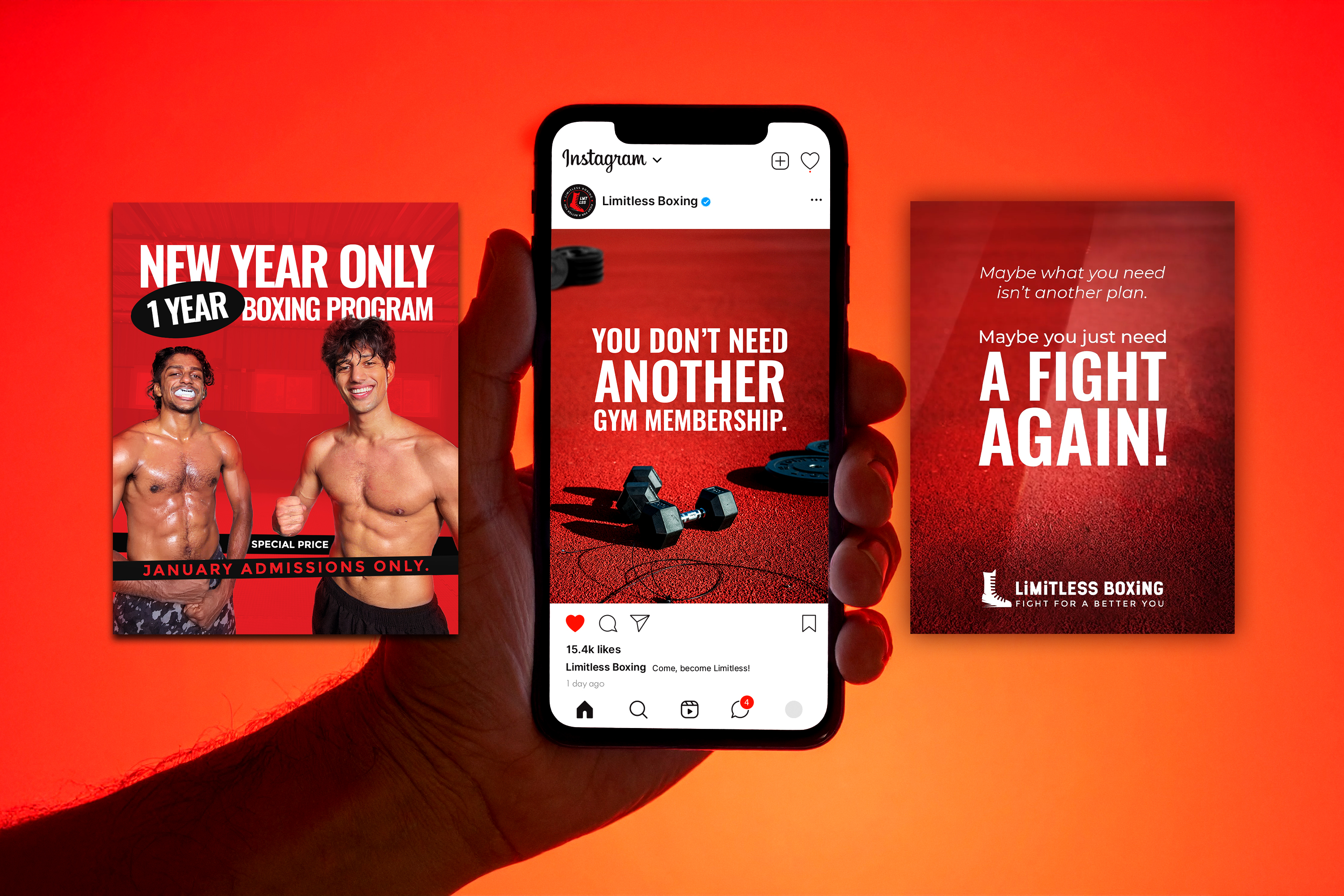
Their feed wasn't doing the work — posts went up without a plan, and nothing was bringing new students through the door. The fix was a content system with three jobs: motivational carousels built to stop the cold scroll, a New Year offer campaign aimed at the post-holiday gym hunt, and athlete-journey carousels — real students telling how boxing changed something for them. One voice, three angles, all built to turn curious into committed.
Earned, Not Given
A reward you wear.
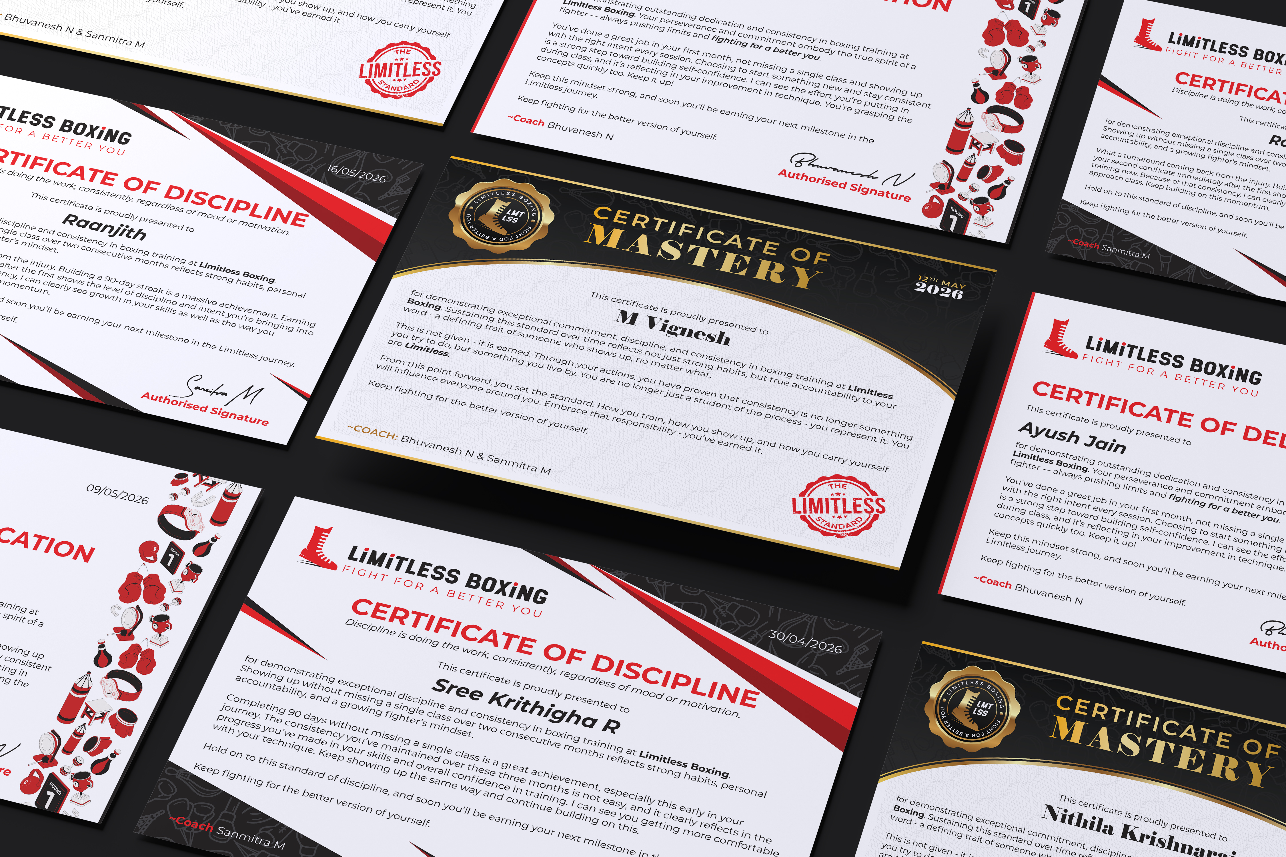
Three certificates marking the levels students climb — Dedication, Discipline, Mastery. Built to feel earned, not handed out. Alongside them, a progress tracker sheet so students can see exactly where they stand class to class.
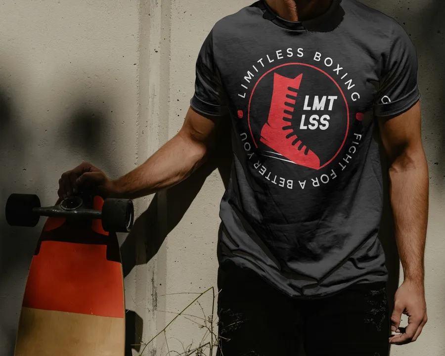
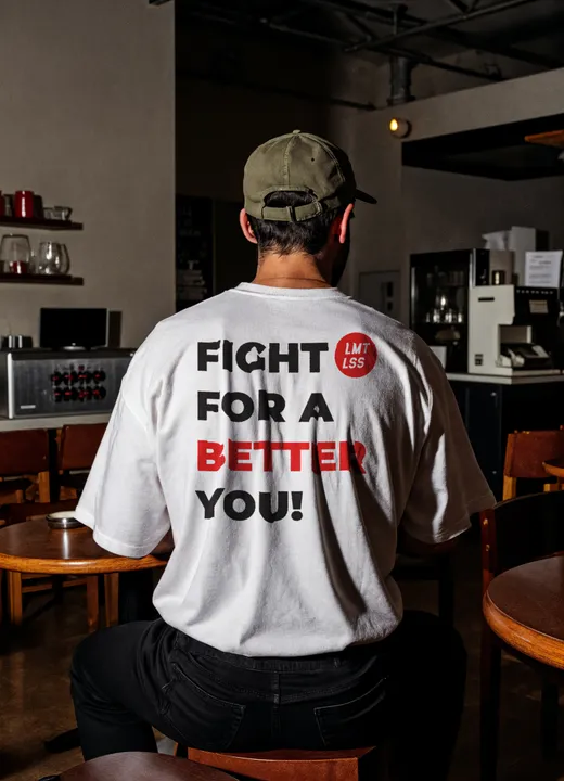
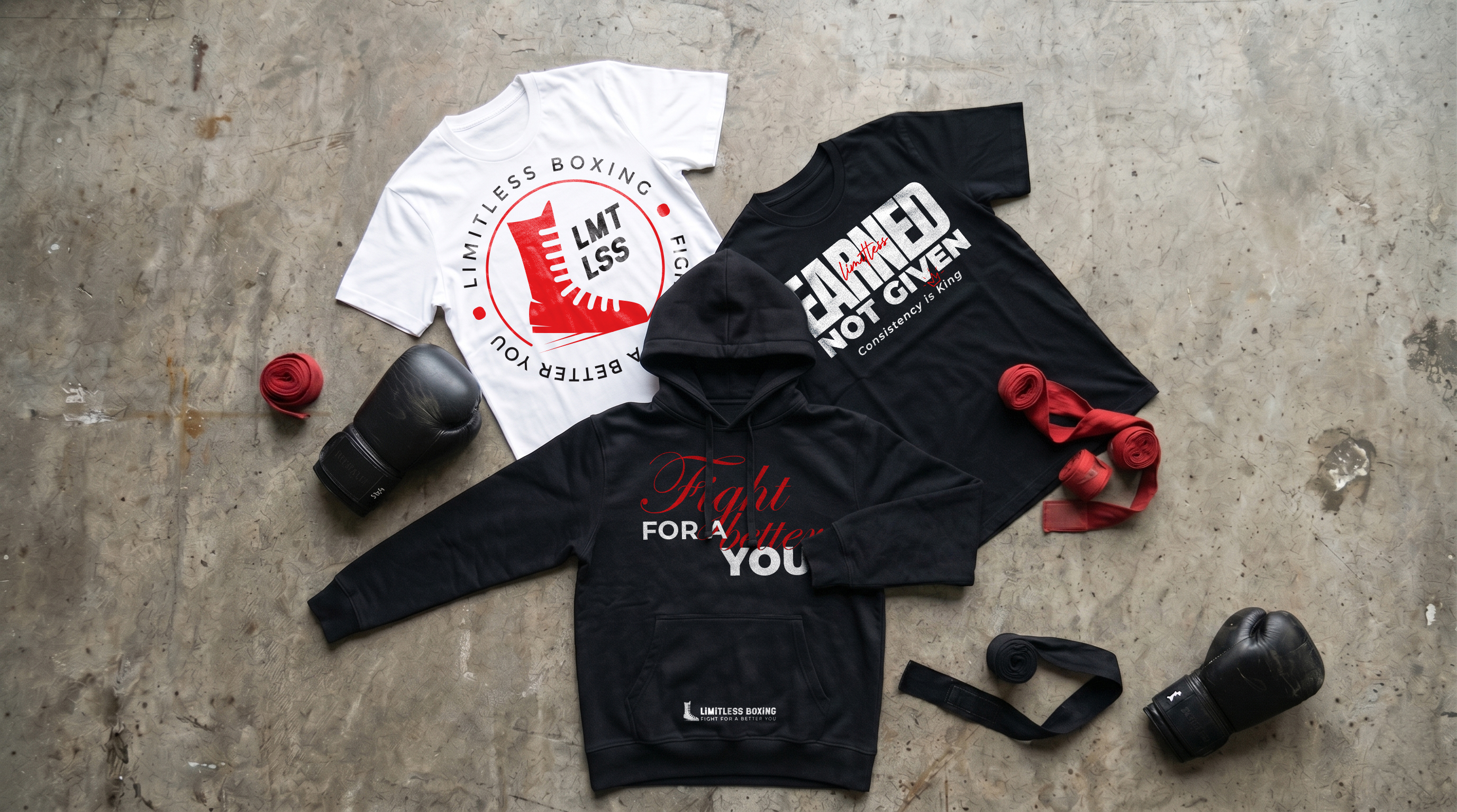
The Earned Not Given tee was designed as the physical reward that goes with the Mastery certificate — students walk out wearing it. The circle-logo tees in black and white were made for the two coach-founders themselves.
Thumbnails
Stop the scroll.
YouTube is where Limitless lives outside the gym. Thumbnails do the heavy lifting — high contrast, tight crops, clear emotion. Designed to stop the scroll on a feed competing for the same eyeballs. A handful of videos also got the edit treatment — mostly text-effect work to give the cuts a bit more punch.