
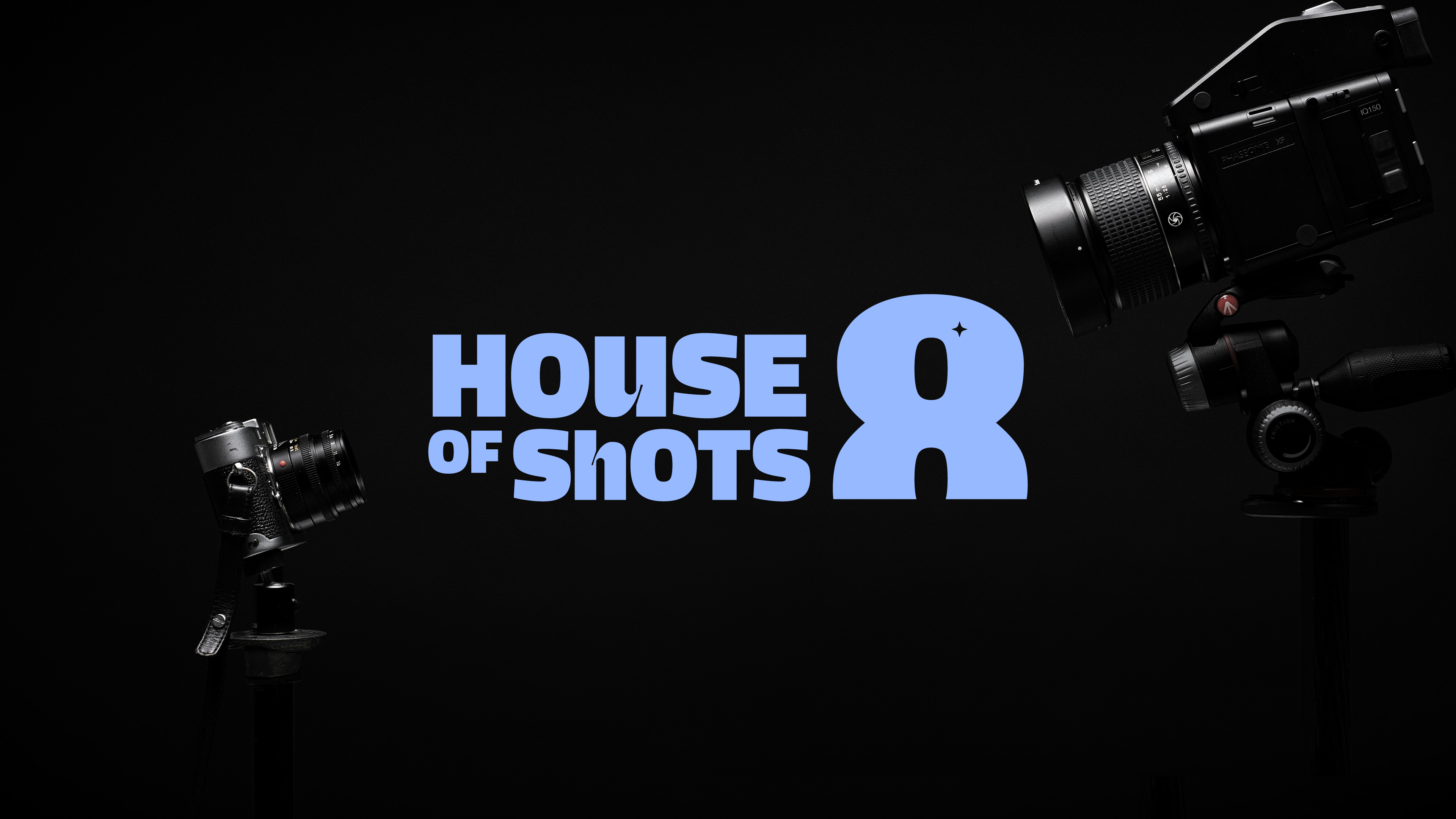
 Brand Identity · Collateral · Guidelines
 House of Shots 8
A production house needed a mark as bold as the work they put on screen.
The Brief
Talent without a brand is just work.
House of Shots 8 had the crew, the cameras, and the reel. What they lacked was an identity that could walk into a room before they did. I took them through a full rebrand: multiple logo directions, a complete identity system, brand guidelines, and collateral, all built to grow with them.
The Mark
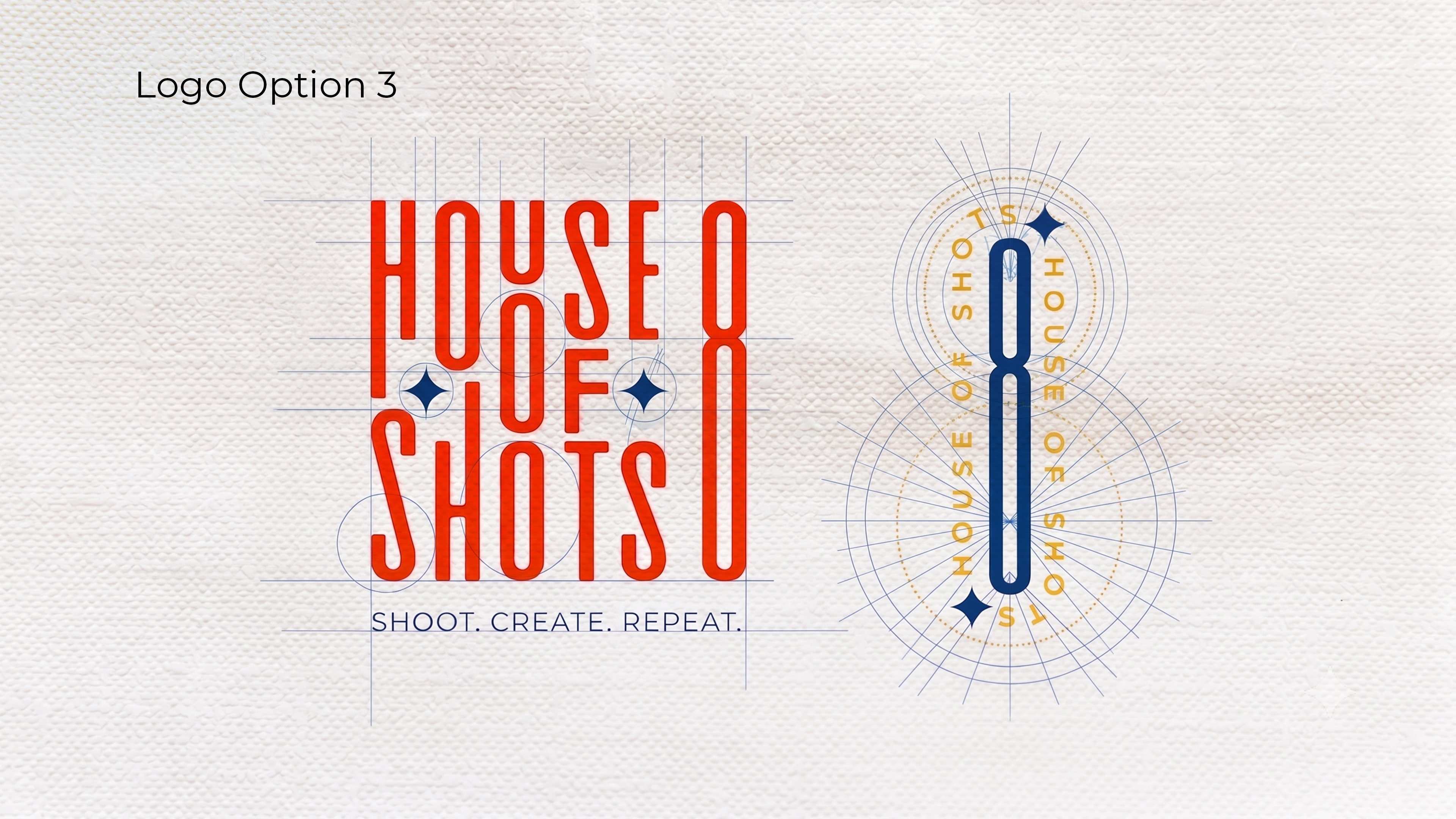
One letterform. Three lockups.
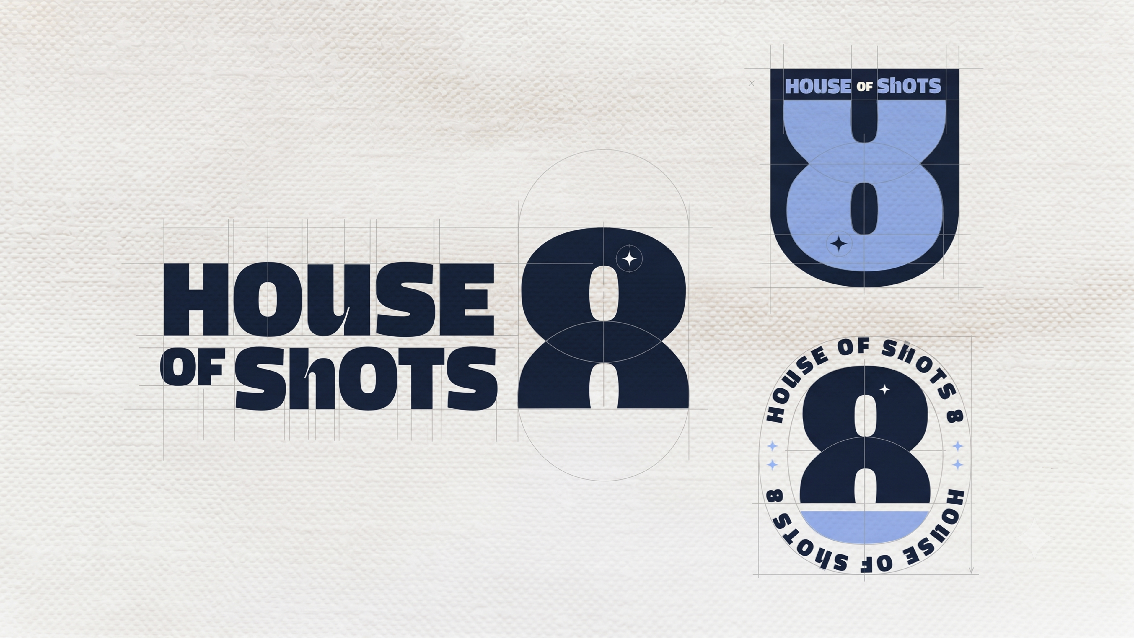
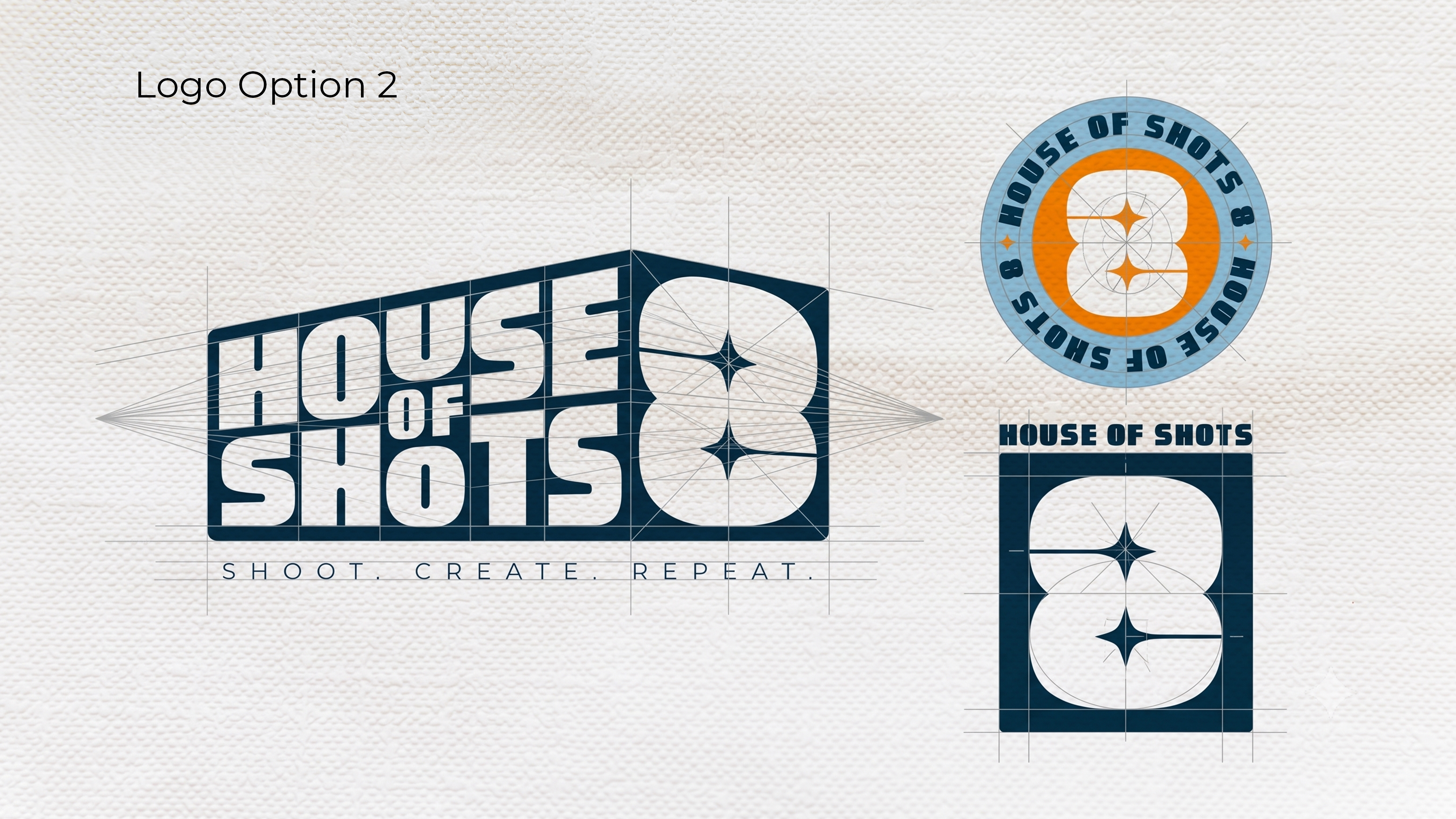
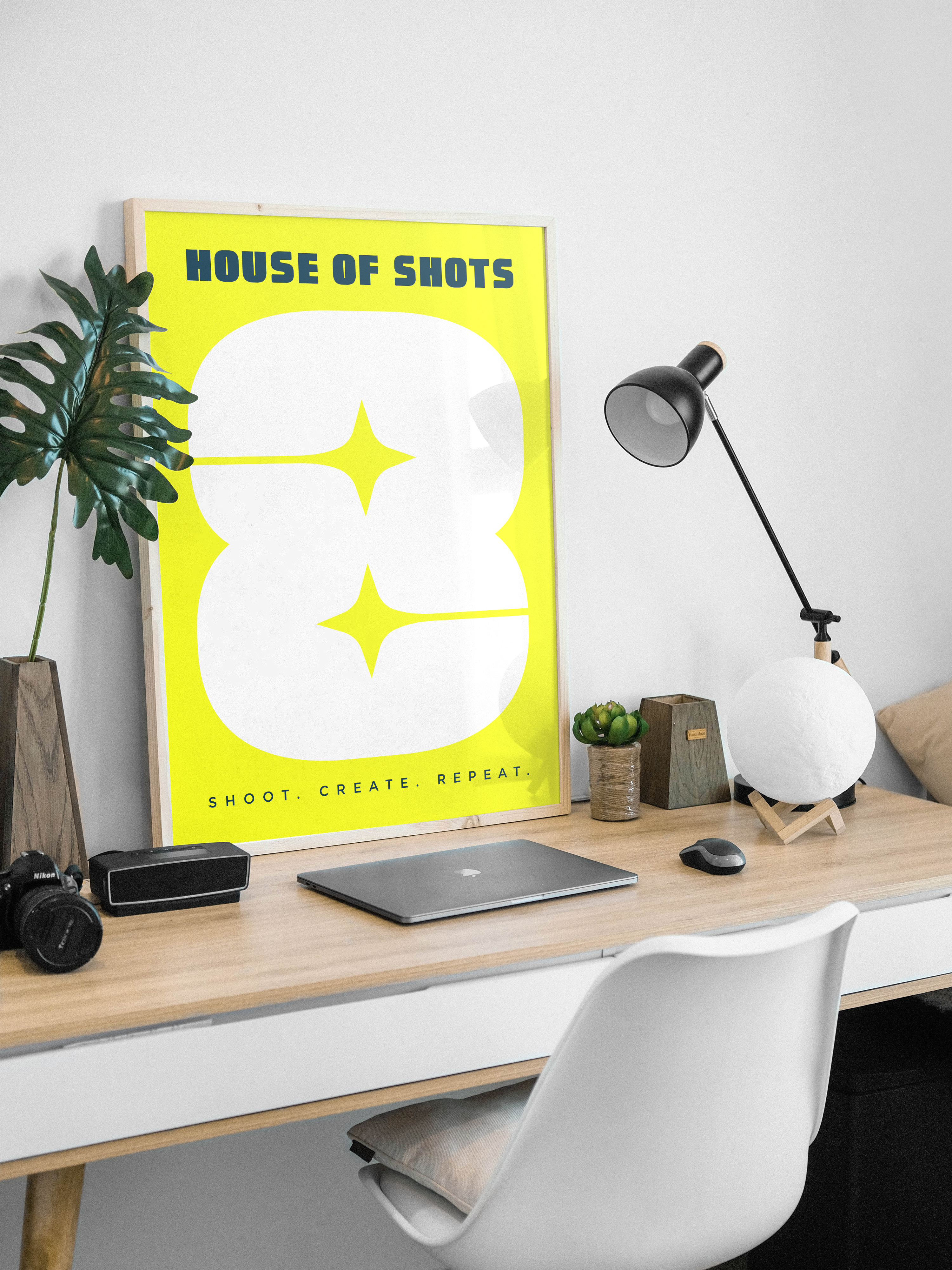
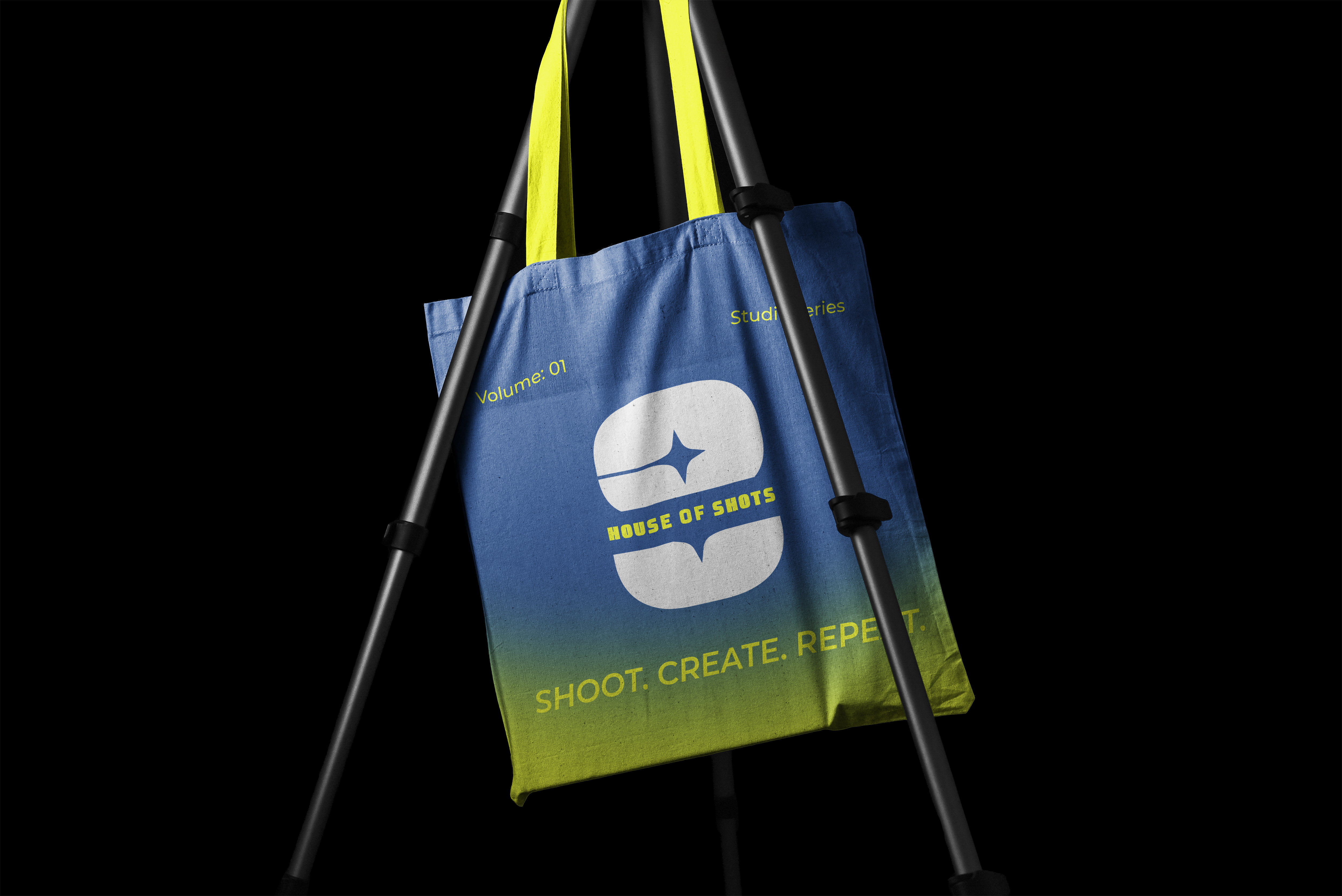
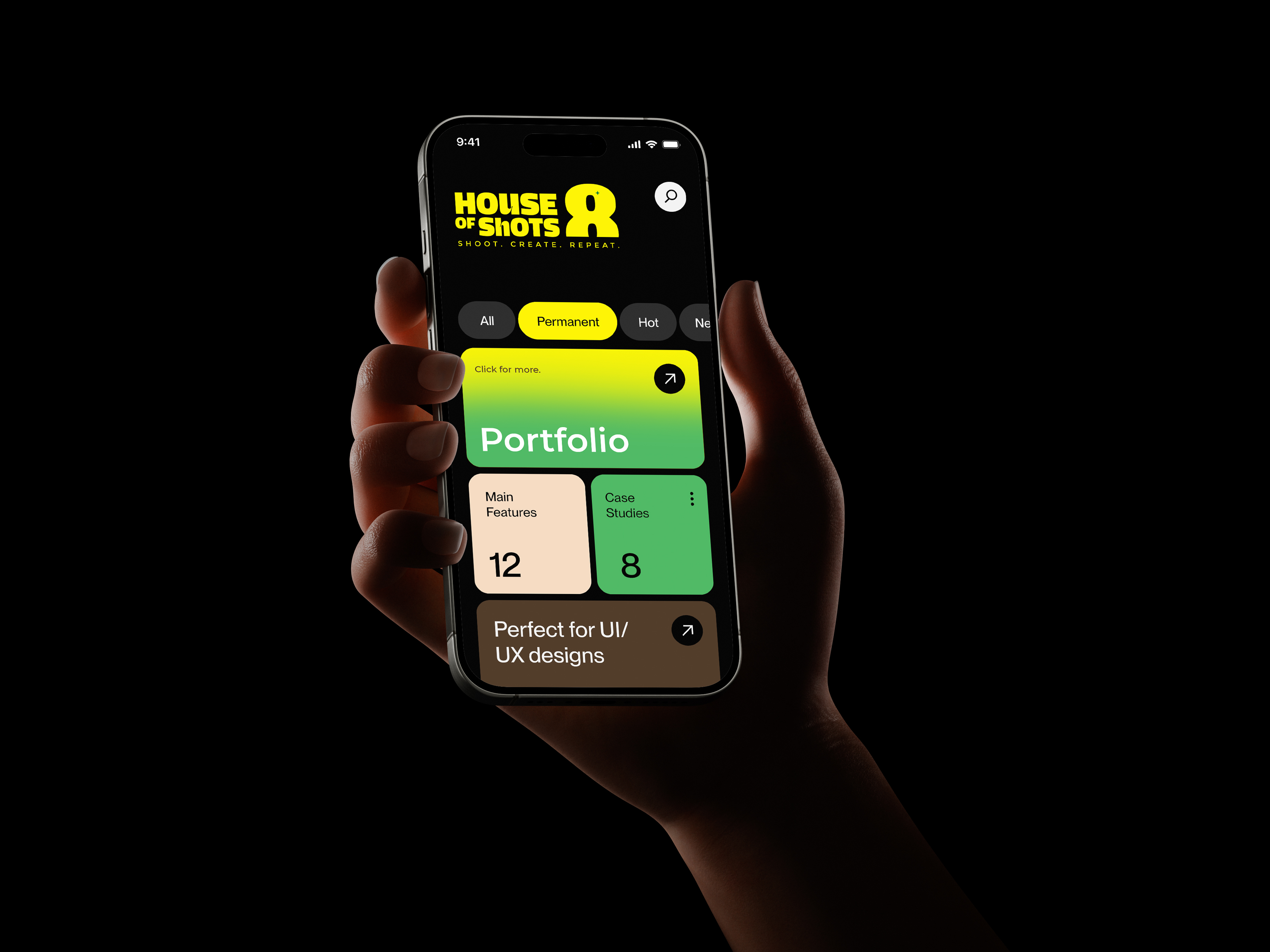
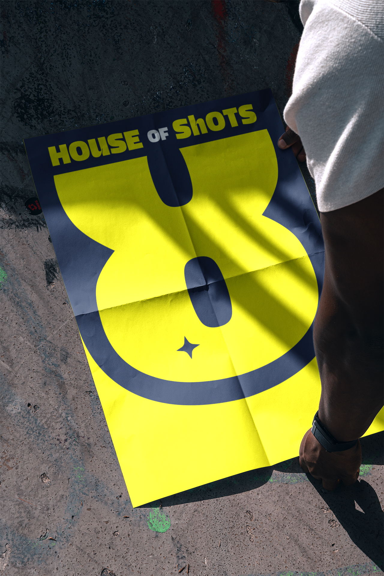
The whole identity hangs on the "8" — a rounded, inflated letterform with a four-pointed star punched into the counter. Bold enough to fill a poster. Precise enough to sit on a sleeve. I built three distinct logo options around it, each with a badge and wordmark variant, so the client could see the range before committing to one direction.
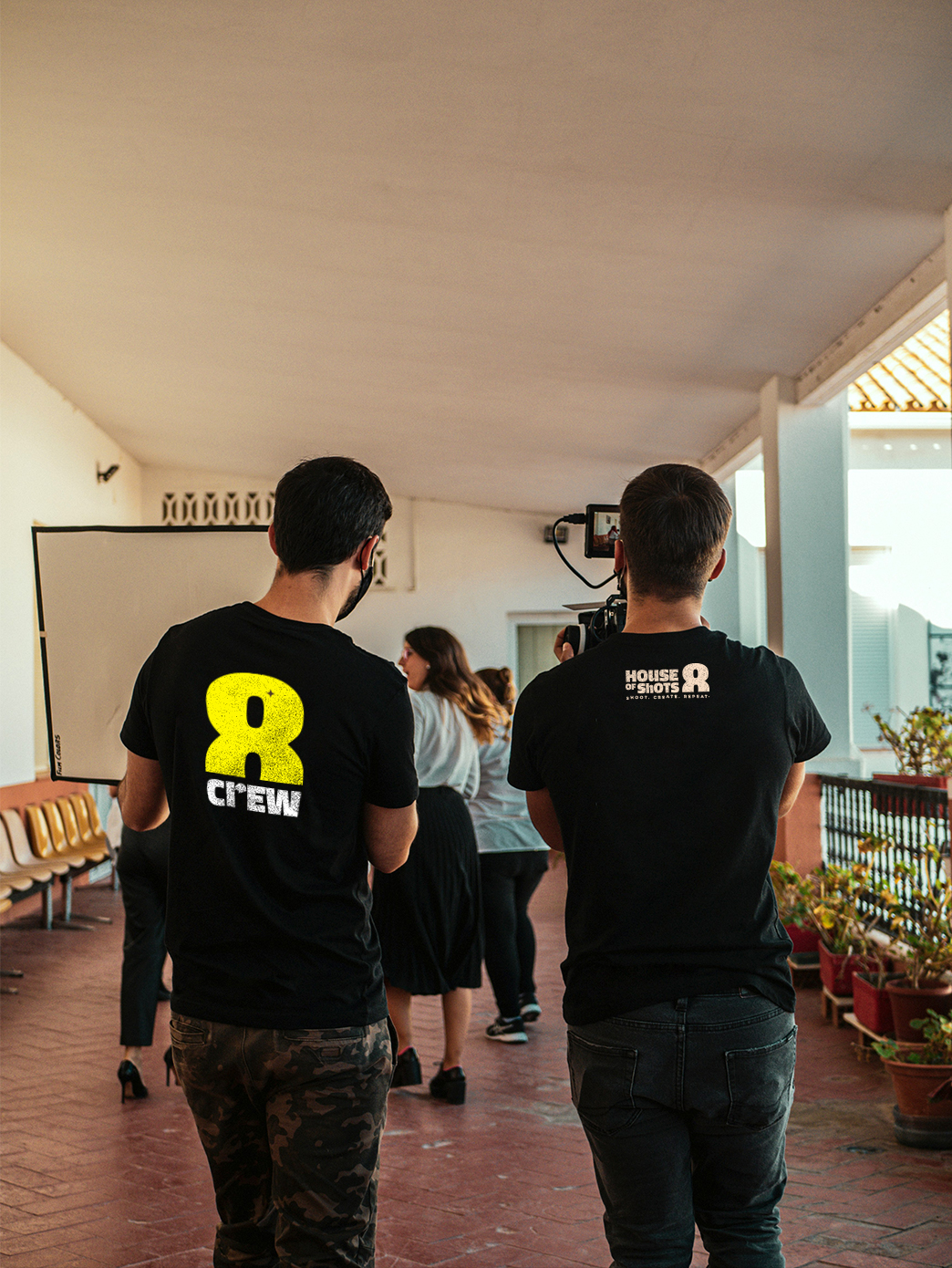
The final mark chose clarity: the bold wordmark paired with the standalone "8" icon, dark navy on periwinkle, and a circular badge for secondary use. One consistent system across every surface.


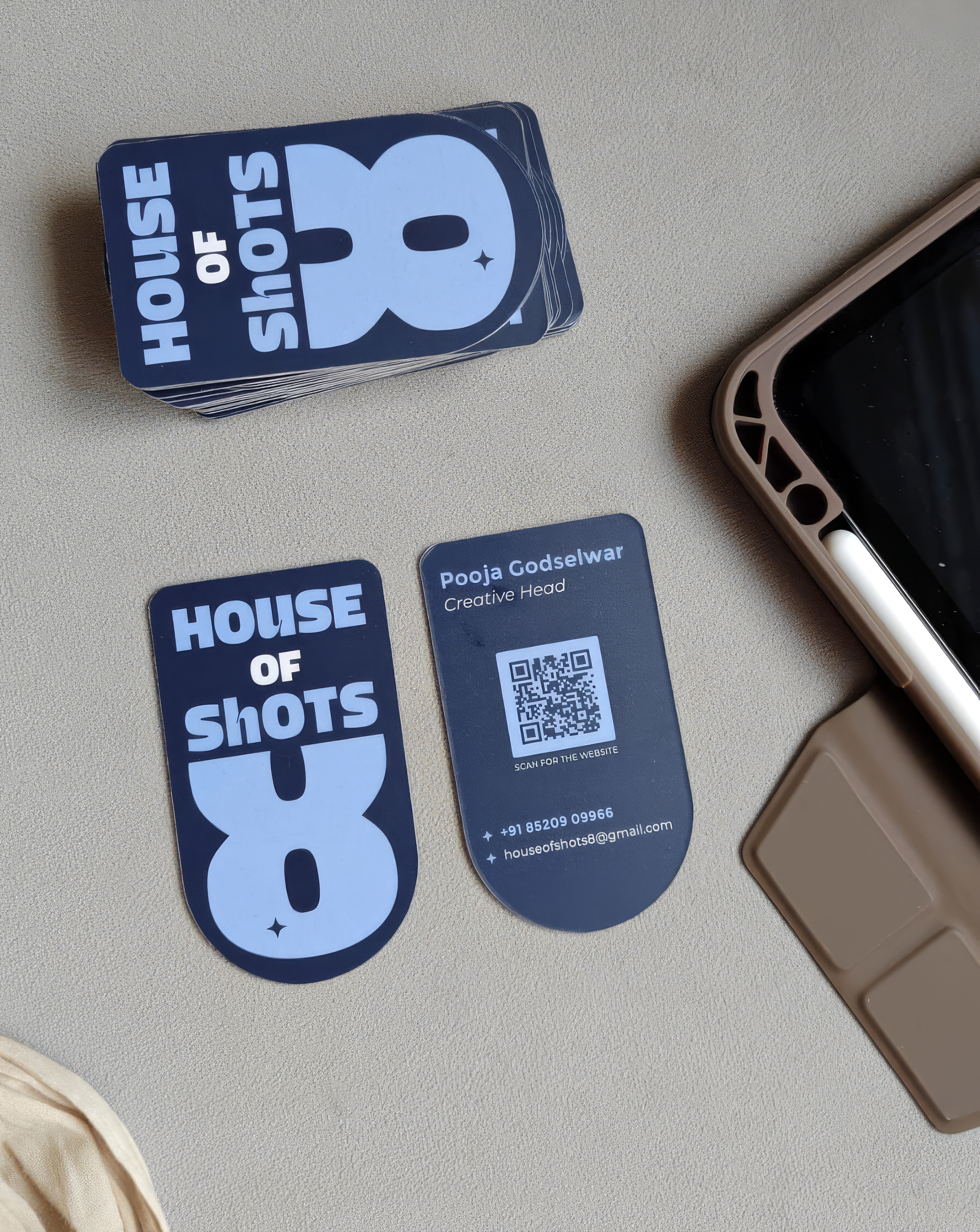
Cut in the shape of the mark.
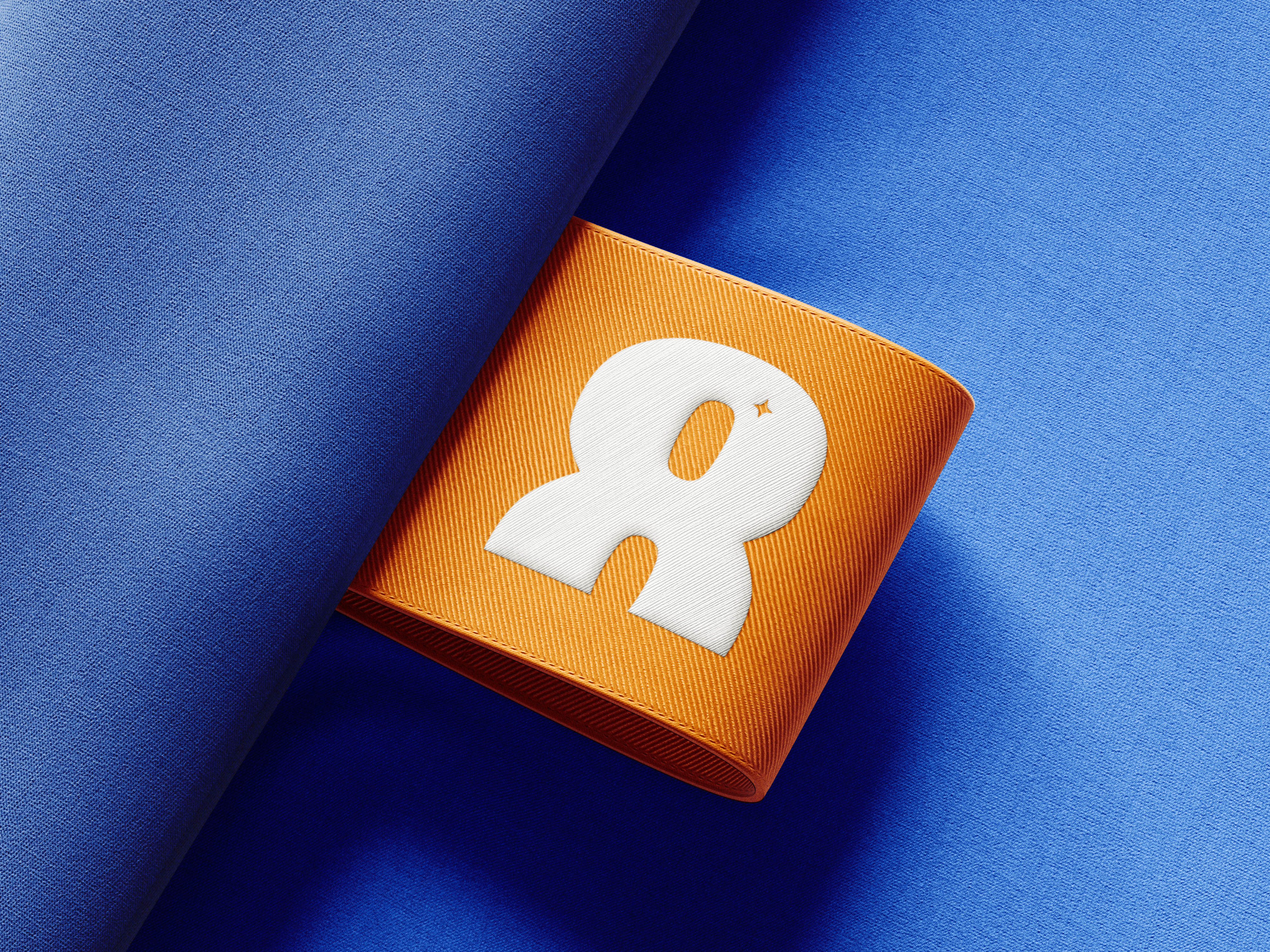
The business card doesn't just carry the logo: it is the logo. Die-cut to follow the silhouette of the "8", printed in the brand navy. The shape does the talking before anyone reads a word. It's the kind of card people don't throw away.
Outcome
A brand ready to grow into.
The rebrand gave House of Shots 8 something they didn't have before: a system. Logo files, colour codes, usage rules, and collateral that all pull in the same direction. They left with a brand they could hand to anyone and trust it would come back looking right.