
 Brand Identity · Logo Design · Collateral
 Cheryl
An industrial company that needed a mark as sharp as their ambition.
The Brief
One company. Two arms. One mark to hold it together.
Cheryl runs two distinct businesses: Enterprises and Logistics. Both needed to feel like they belonged to the same family while standing apart from each other. I explored three full directions, each with its own personality, and presented every one with real-world mockups so the decision wasn't a guess.
The Mark
Bold enough to mean business.
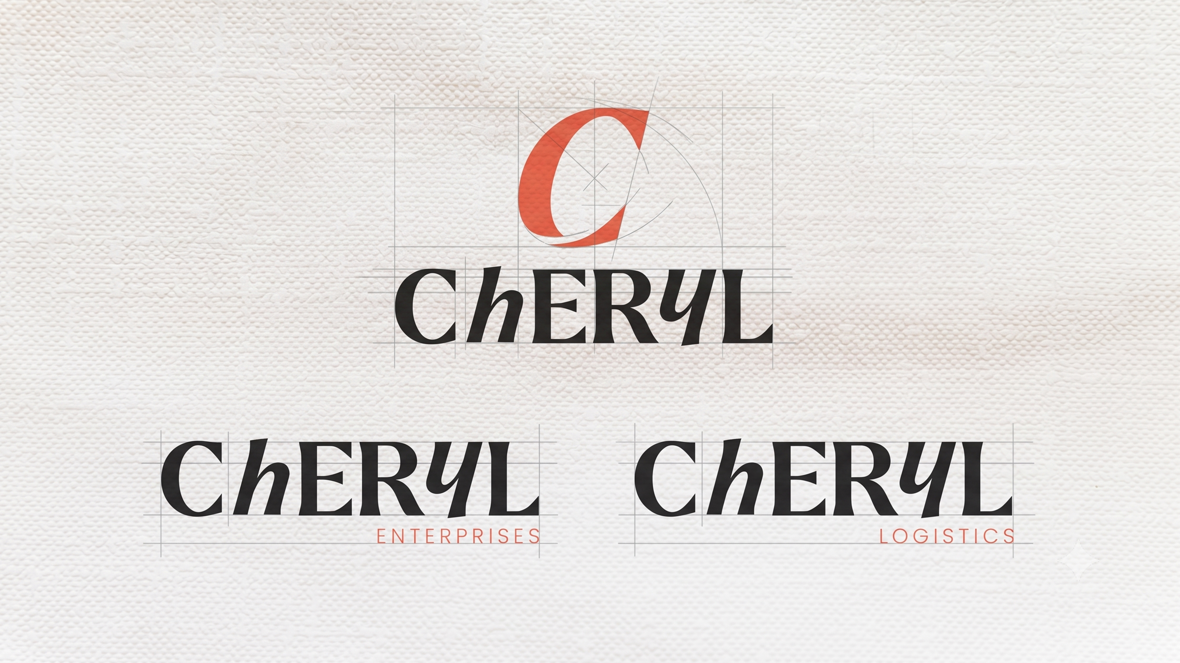
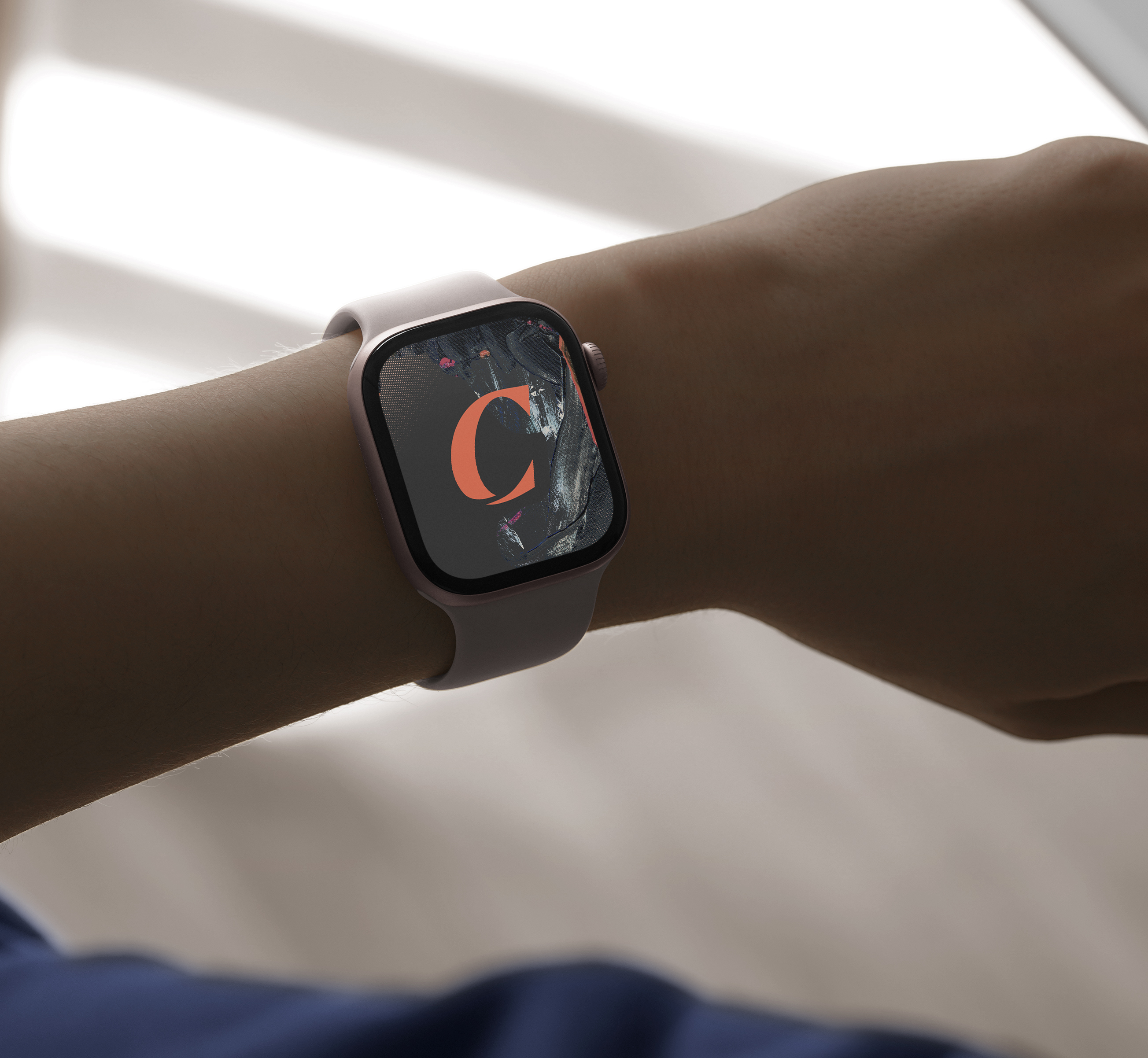
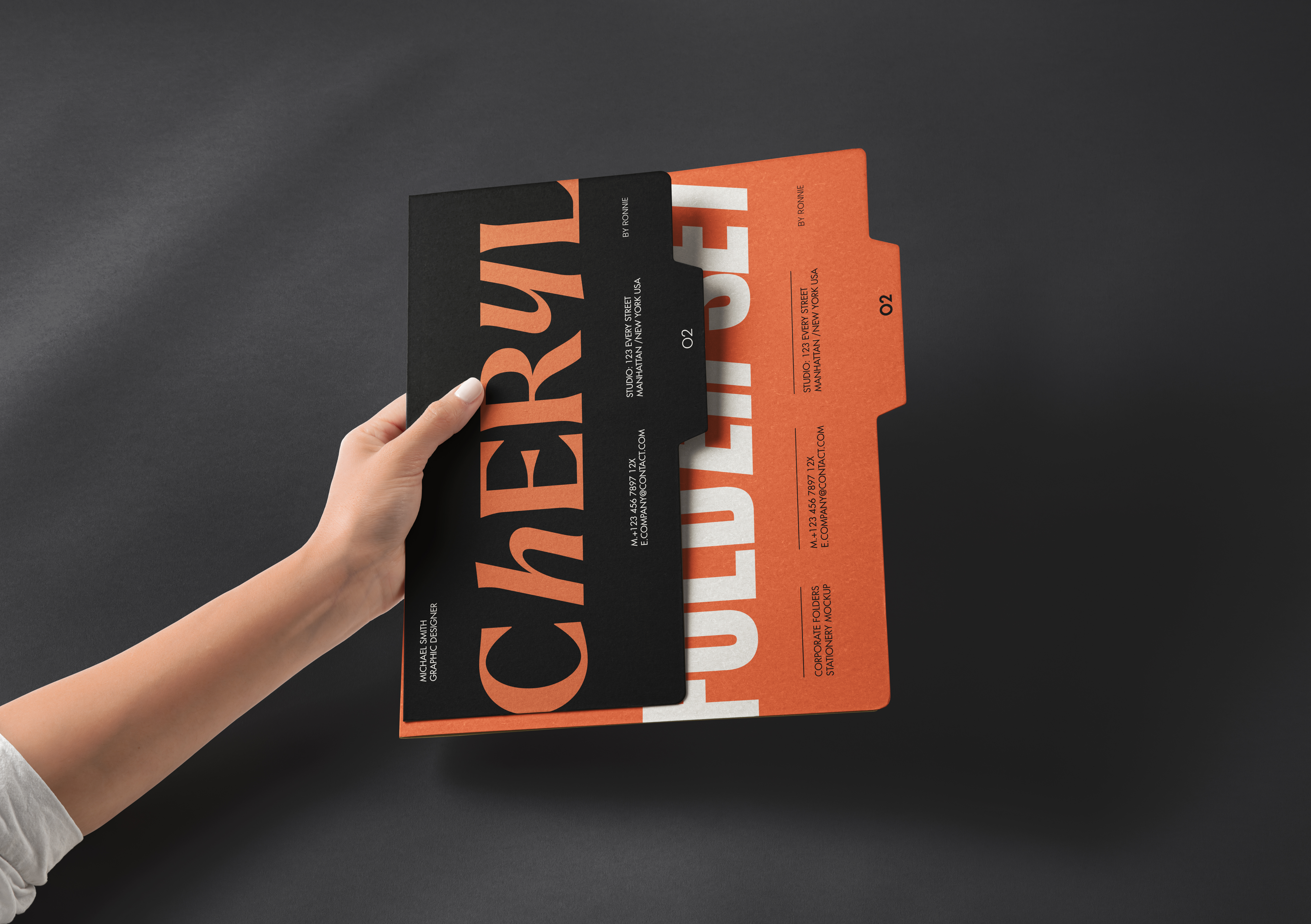
The chosen direction leads with a custom serif "C" icon and a bold mixed-case wordmark — confident, industrial, and flexible enough to carry both Enterprises and Logistics without losing its identity. The coral sits against near-black for maximum impact, and each division gets its own sub-wordmark within the same system.
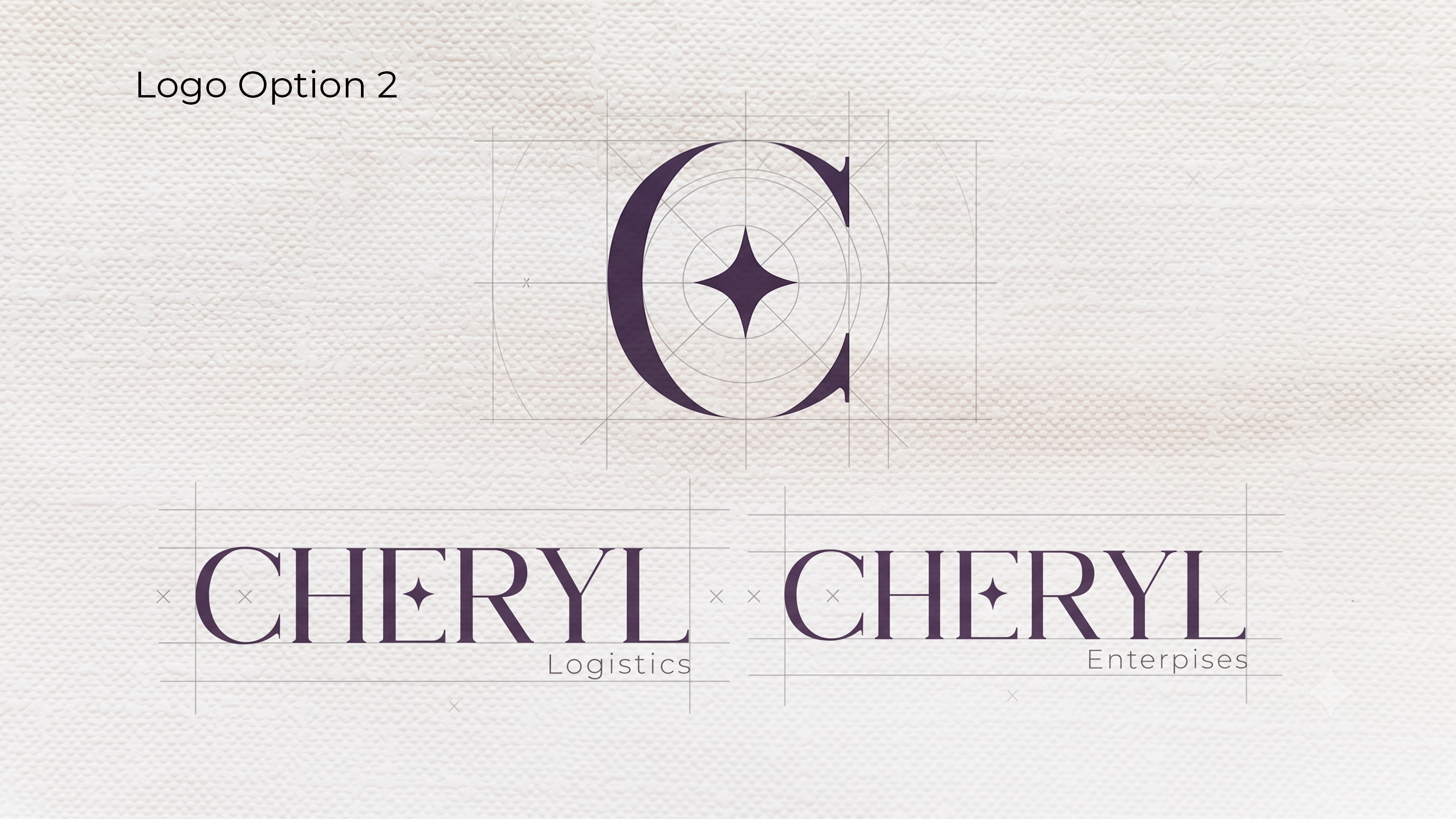
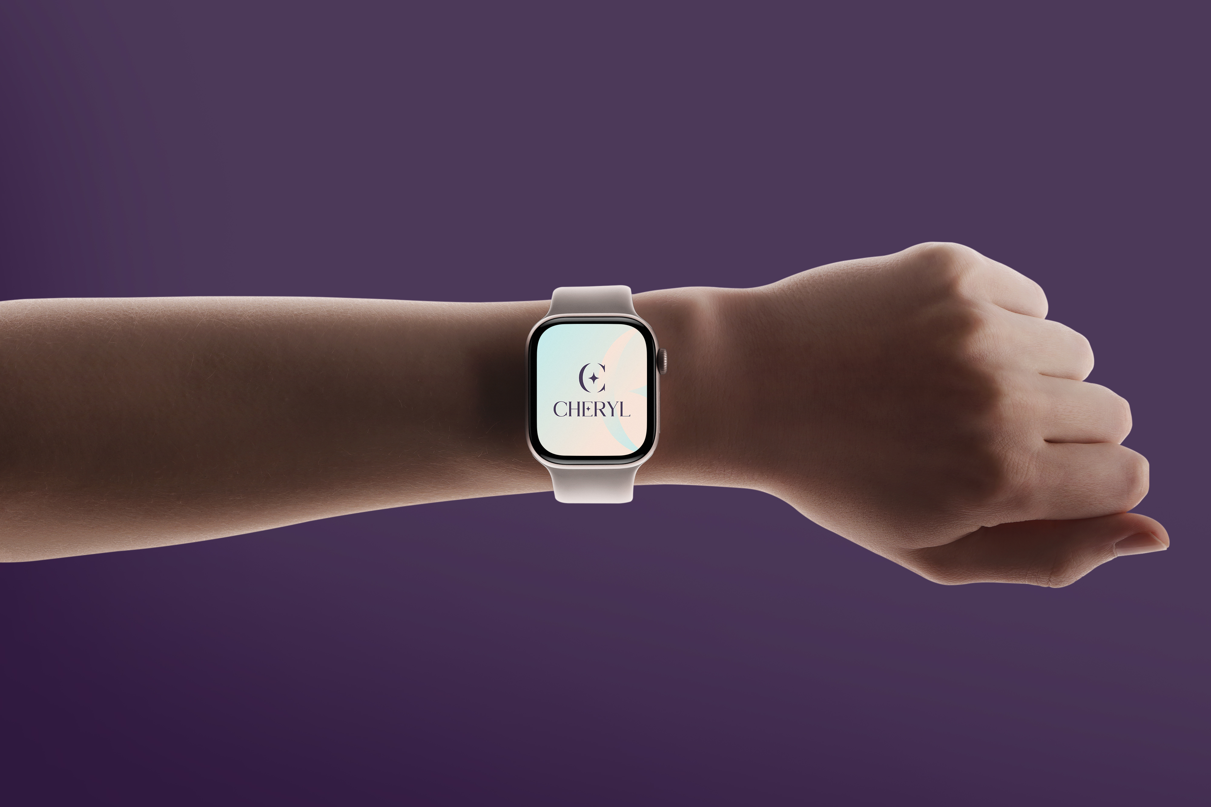
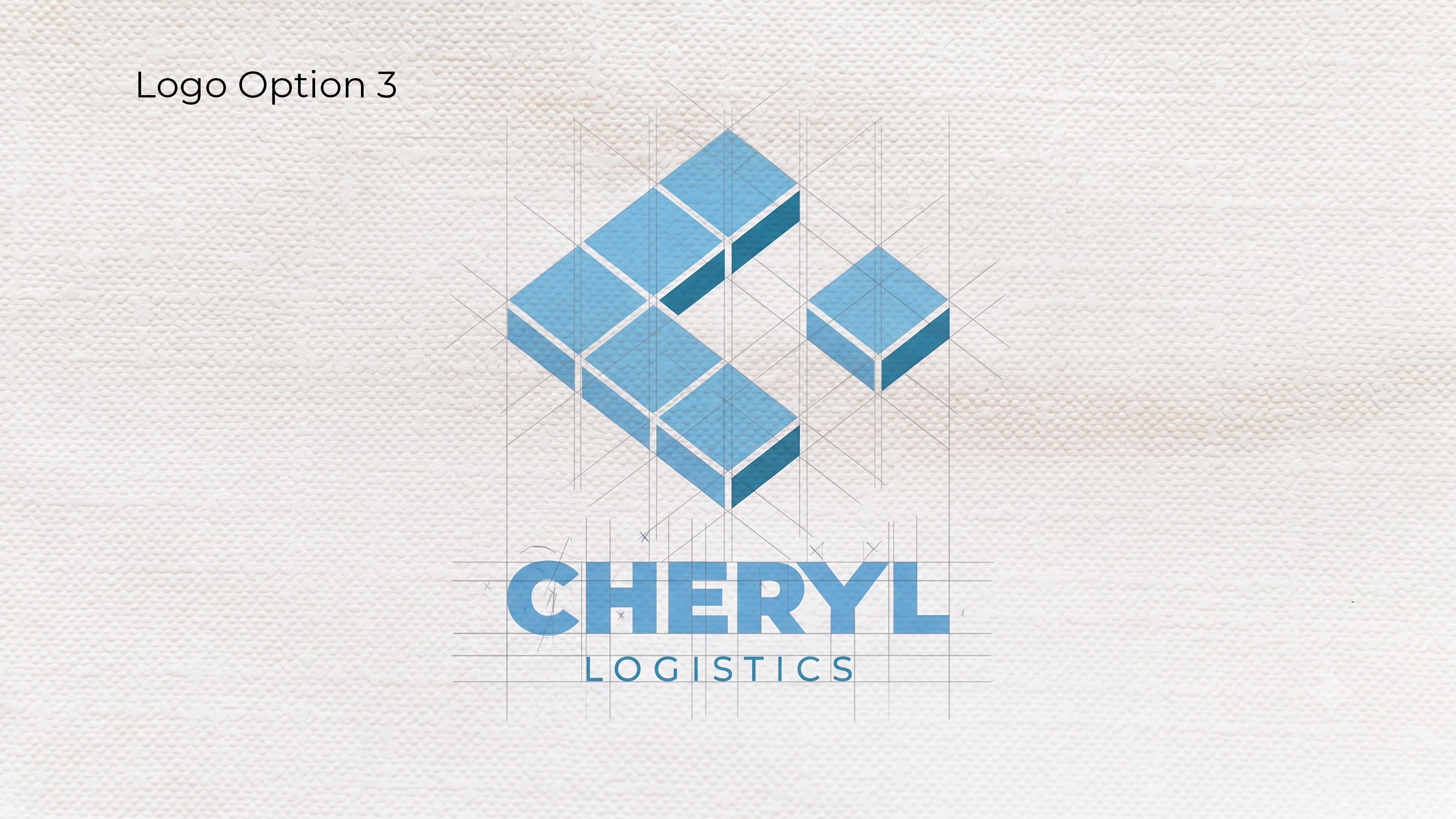
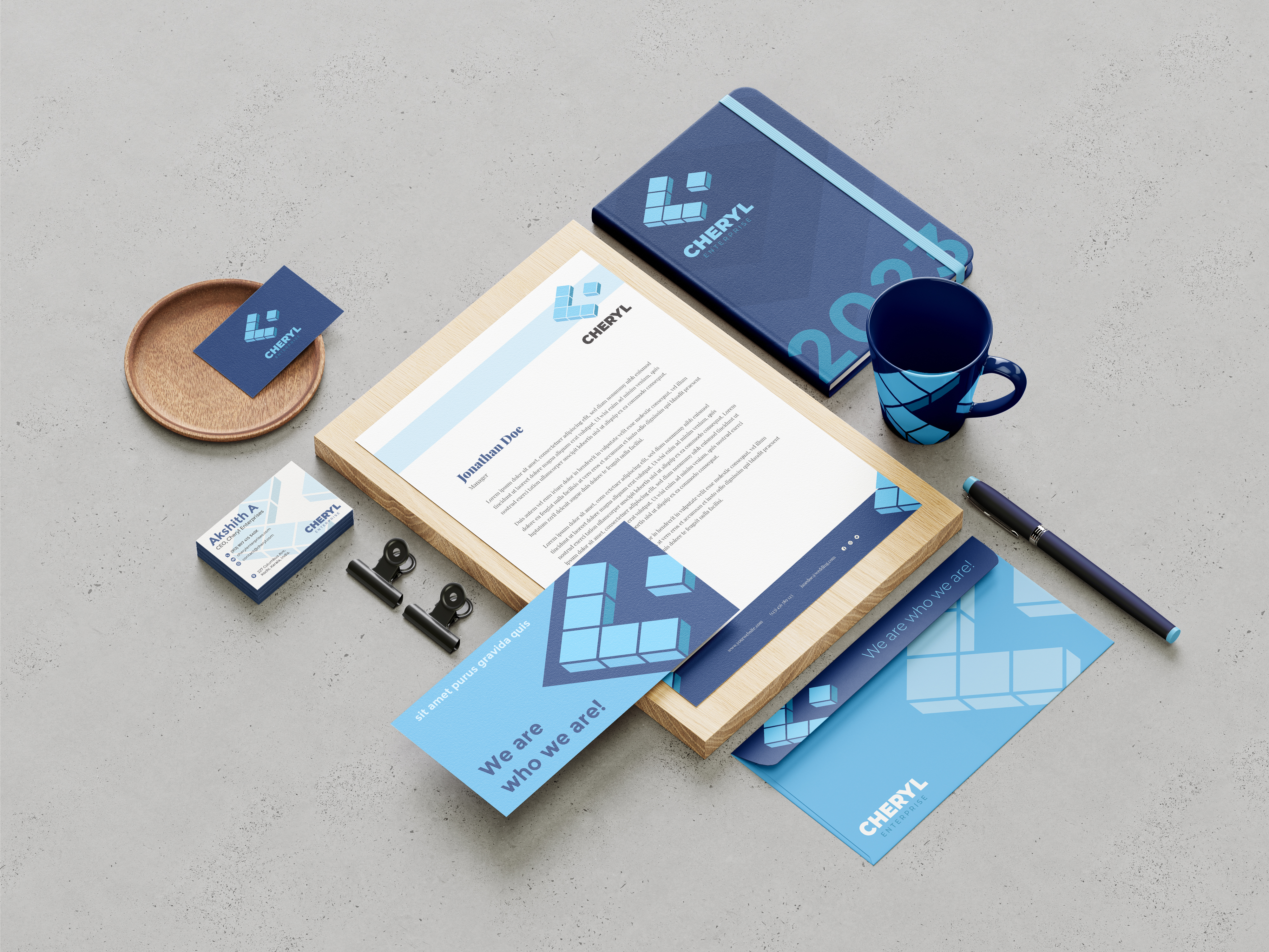
Two other directions were also fully developed: an elegant serif mark in deep violet, and an isometric geometric "C" in blue built around the logistics side of the business. The client had real choices, not just one direction dressed up three ways.
The System
Every surface, accounted for.
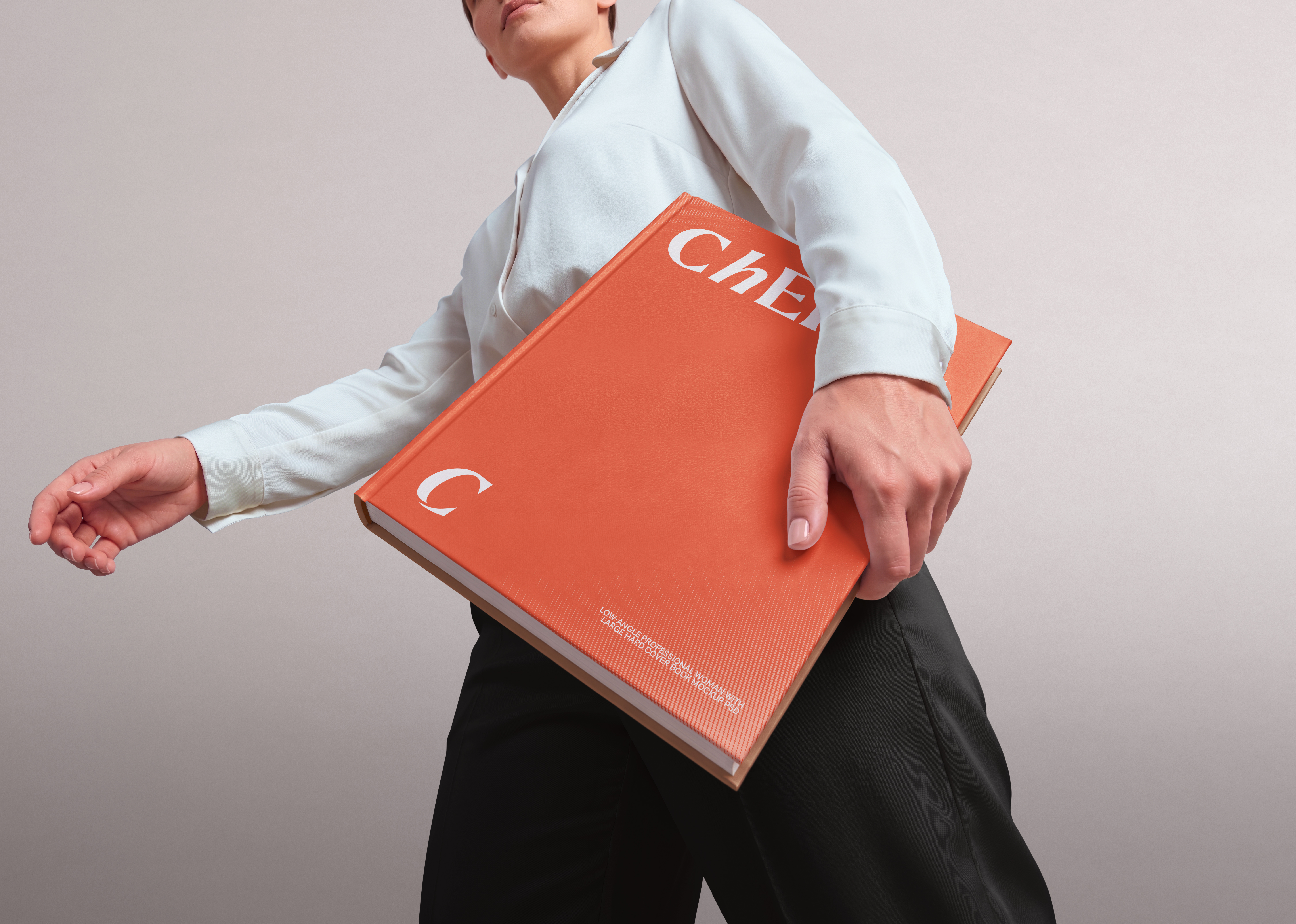
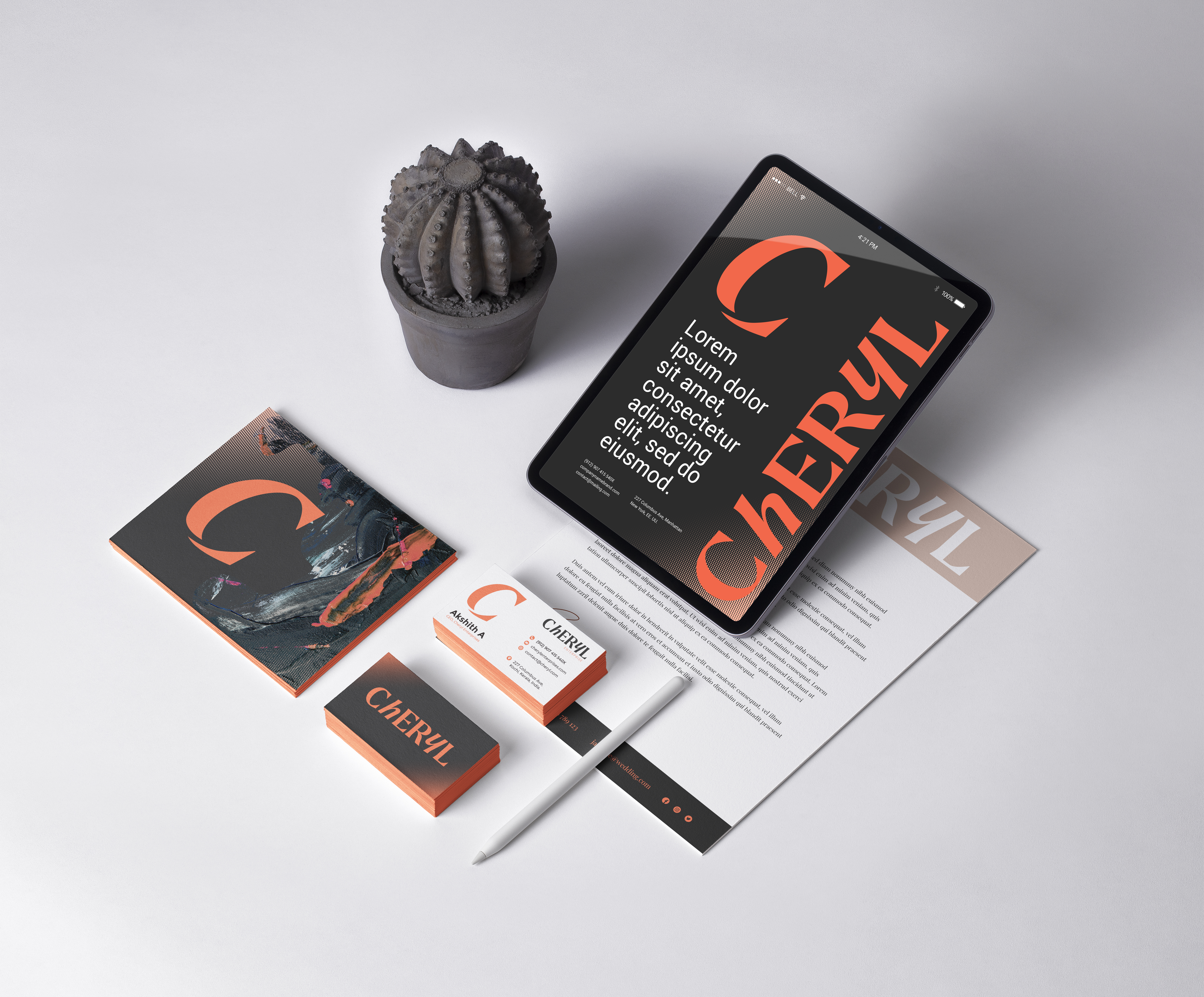
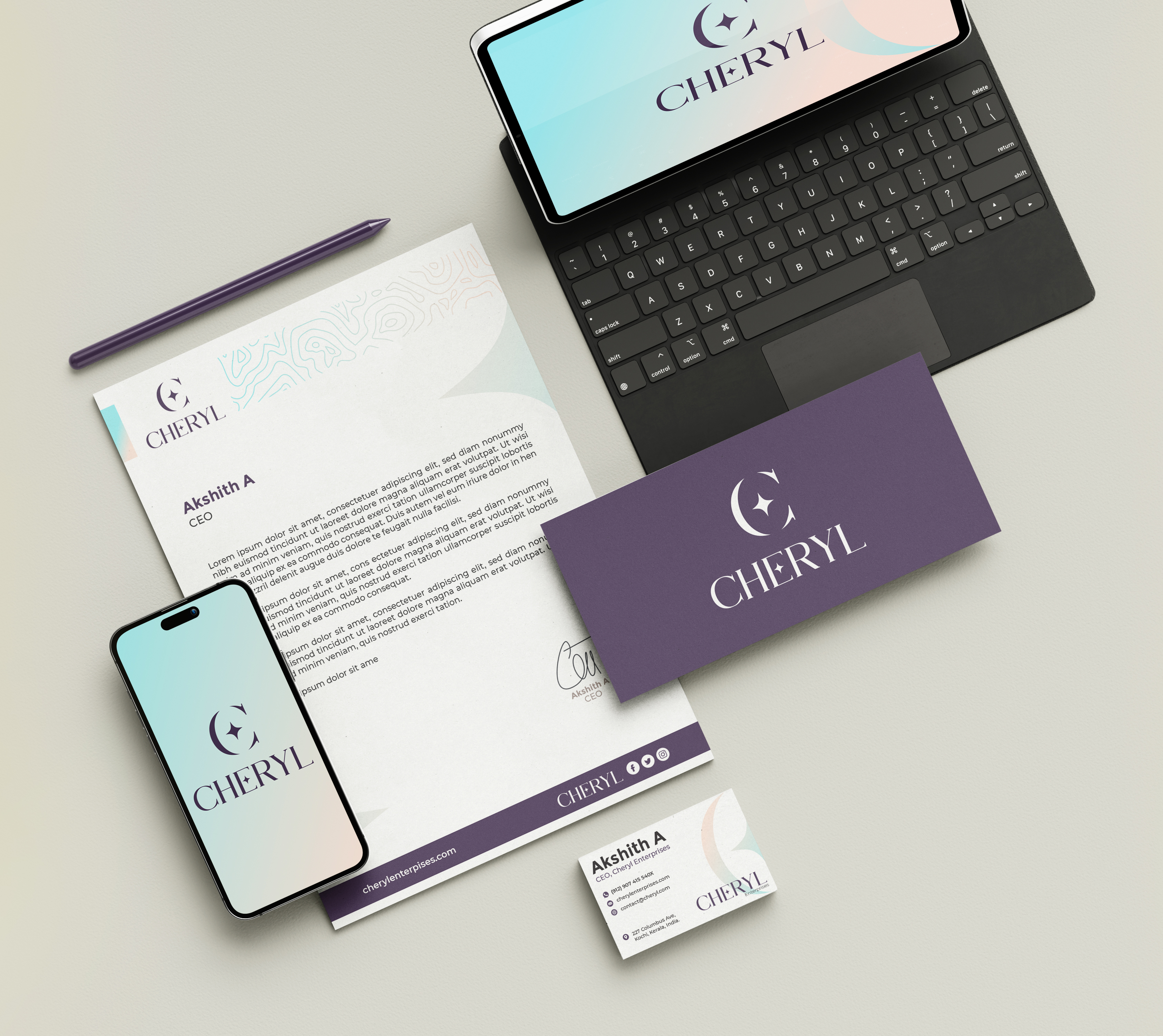
Beyond the logo, the identity was applied across stationery, digital screens, business cards, letterheads, and branded collateral. Each application was mocked up against real-world surfaces so the client could see exactly what they were choosing, not just what it looked like on a screen.